
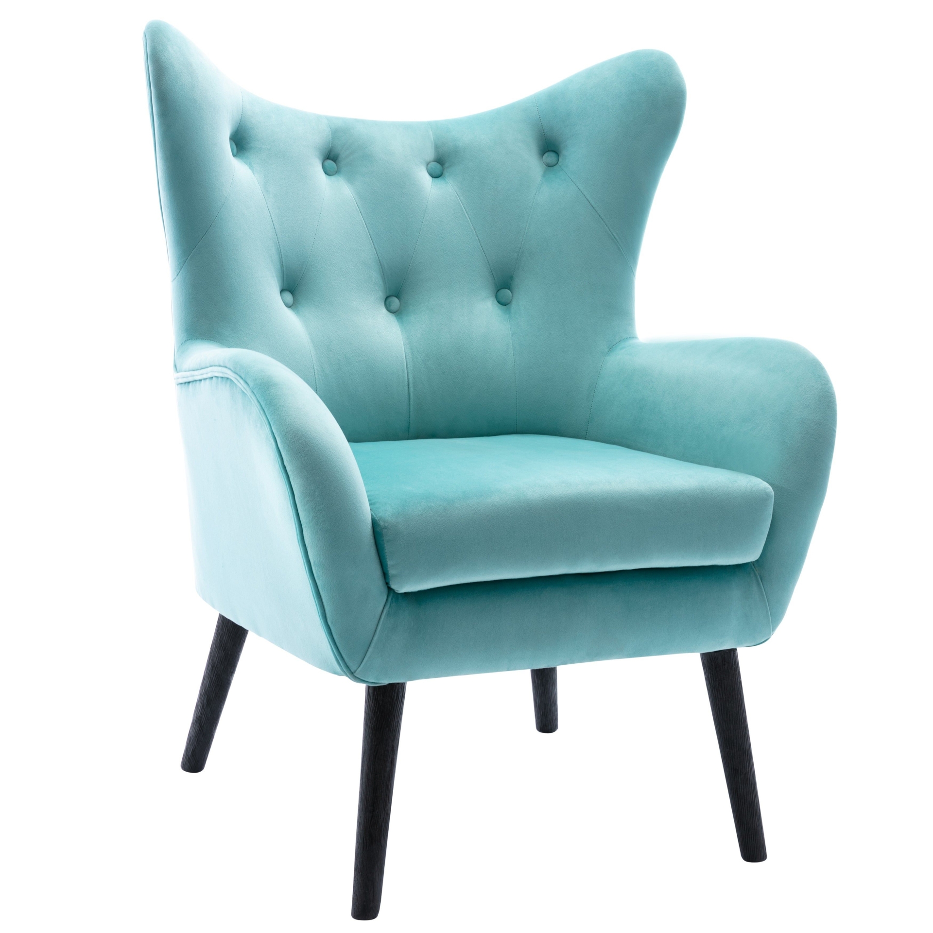
Turquoise is a combination of blue with a touch of yellow. It falls on the color spectrum between green and blue and carries qualities of each of these colors. It is important to understand the psychology of turquoise before you start designing because it has both calming properties and the energy of yellow.
What is the Psychology of Turquoise?
The color turquoise is known for its healing ability. It can create emotional balance and stability. It radiates the tranquility of blue, the balance of green with the positive energy of yellow. The use of turquoise in a space is known to recharge and alleviate feelings of stress or loneliness. In the right amount it promotes clear thinking. However, too much turquoise can have the opposite effect. Turquoise carries the uplifting energy of the color yellow. An abundance of the color can be overstimulating and instead of creating calm, can cause too much emotion.
What are the Best Ways to Use Turquoise in Your Home?
Refrain from using brighter shades of turquoise as a singular paint color in a room. Instead opt for paler shades or a patterned wall covering that incorporates turquoise.
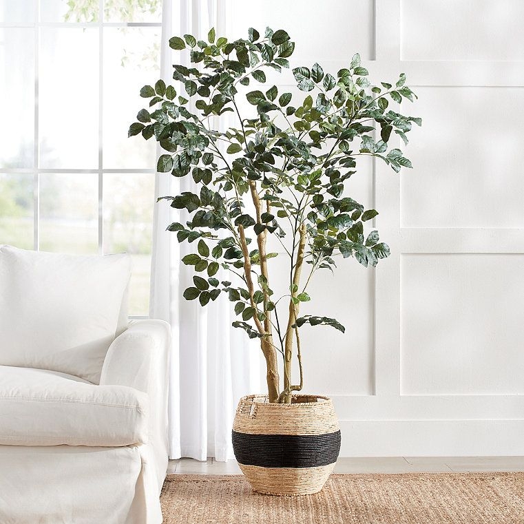
Turquoise is an excellent color to add to space for work or creativity. Add turquoise accents in office spaces, playrooms or art studios.
Limit turquoise in bedrooms or spaces for relaxation because it can be too energetic. Add in small accessories of the color instead of using it as the main color in the room.
Use turquoise on outdoor furniture and cushions. The color is warm and welcoming for a seating area.
Paint the inside of a neutral color cabinet turquoise to add a fun pop of color when you open it.
What Colors Go with Turquoise?
Turquoise is a color between green and blue with yellow undertones. Turquoise is welcoming and calming. It can also add a bit of energy to a room, a property it gets from yellow. However, it should be balanced with other colors in order to avoid being overstimulating. Before you start designing with turquoise, read about the rules of color combination, which we refer to in our color pairings.
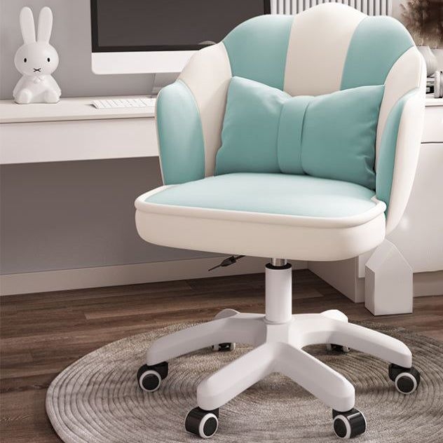
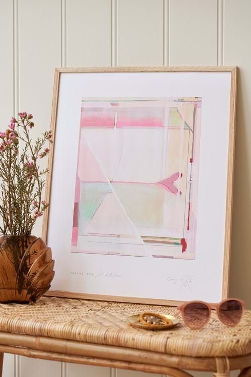
Turquoise + Pink
Turquoise and pink are a bold combination. To keep them from overwhelming a space, use paler shades of both colors. For a serene room, use a soft shade of turquoise on the walls and add in light pink accessories such as throw pillows, curtains or artwork.

Shop The Look
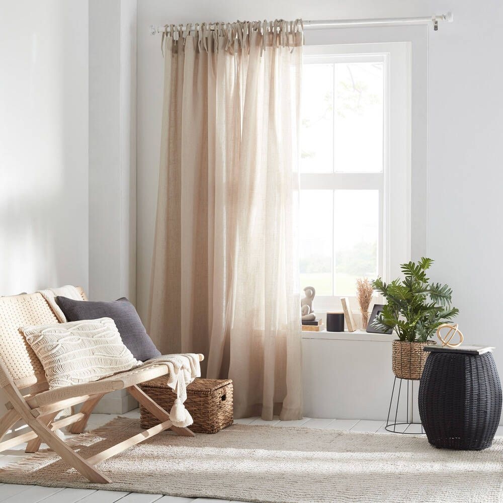
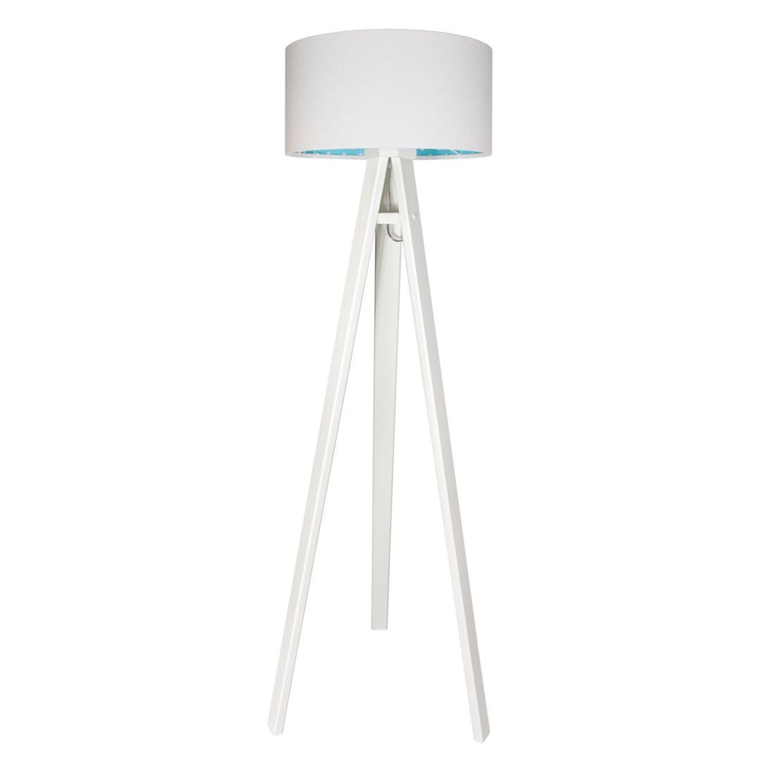
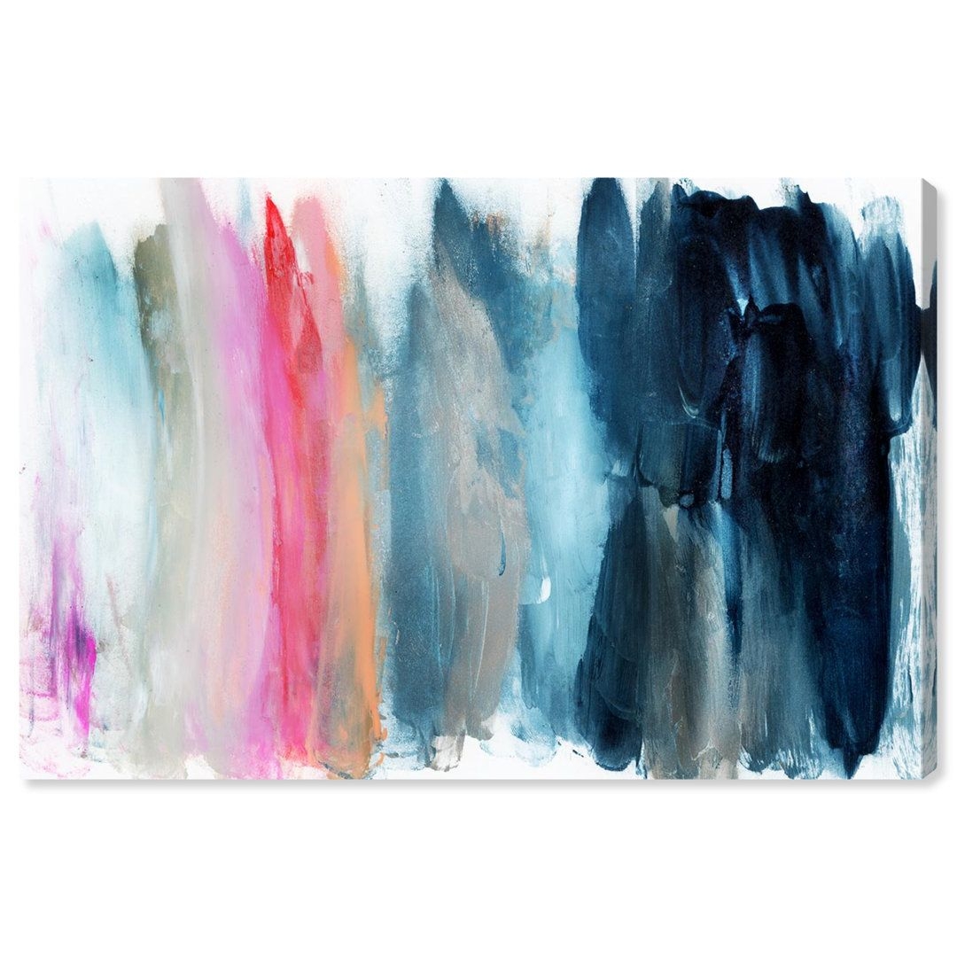
Turquoise and Pink Office Design
Turquoise and Pink Office Design

Turquoise and Pink Office Design
Turquoise and Pink Office Design
Turquoise and Pink Office Design
Turquoise and Pink Office Design
Turquoise and Pink Office Design
Turquoise and Pink Office Design
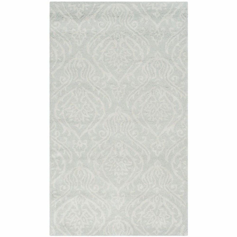
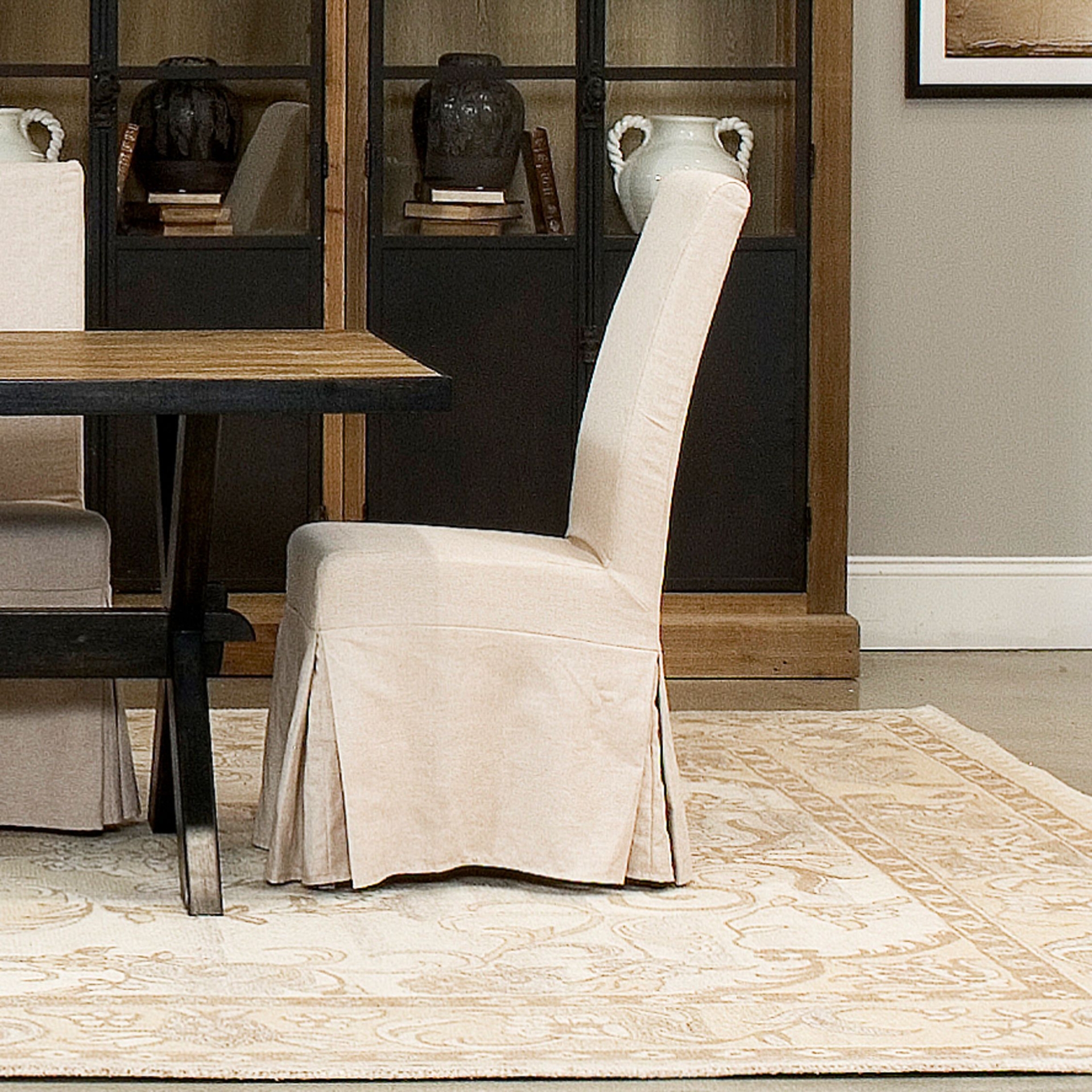
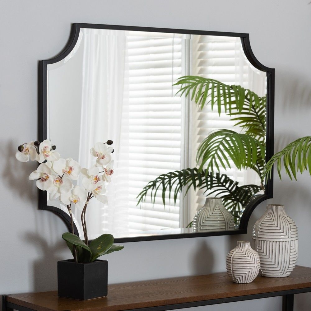
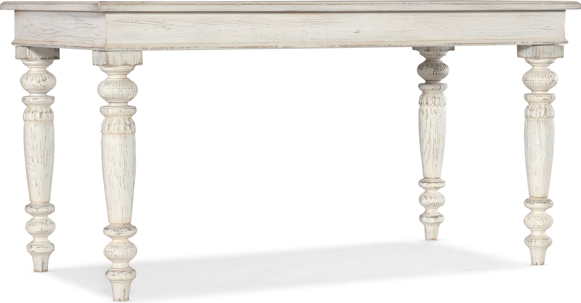
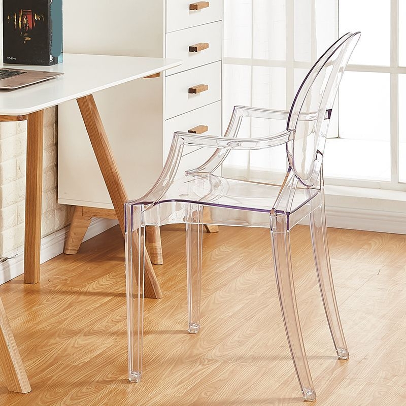
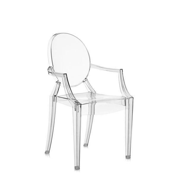
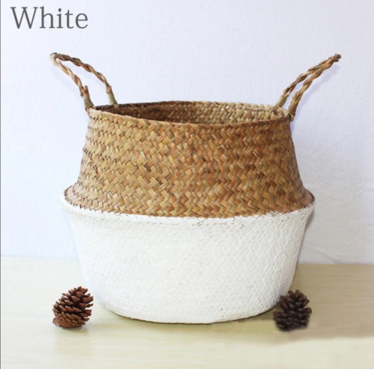
Turquoise + White
Turquoise and white can be a serene or vibrant pairing. You can easily mix and match these colors in varying shades. In an all-white room, make turquoise the focal point. Paint a singular piece of furniture turquoise while keeping the rest of the room shades off white and neutral.

Shop The Look
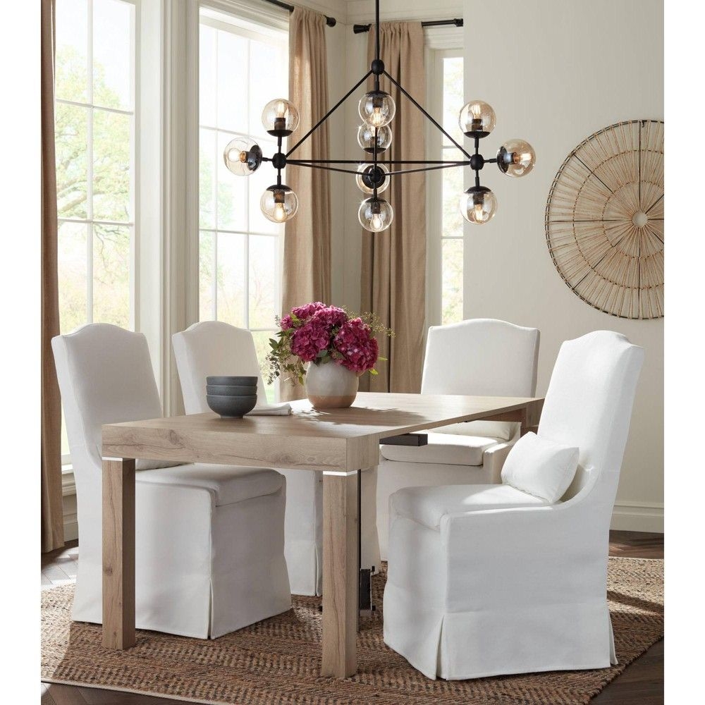
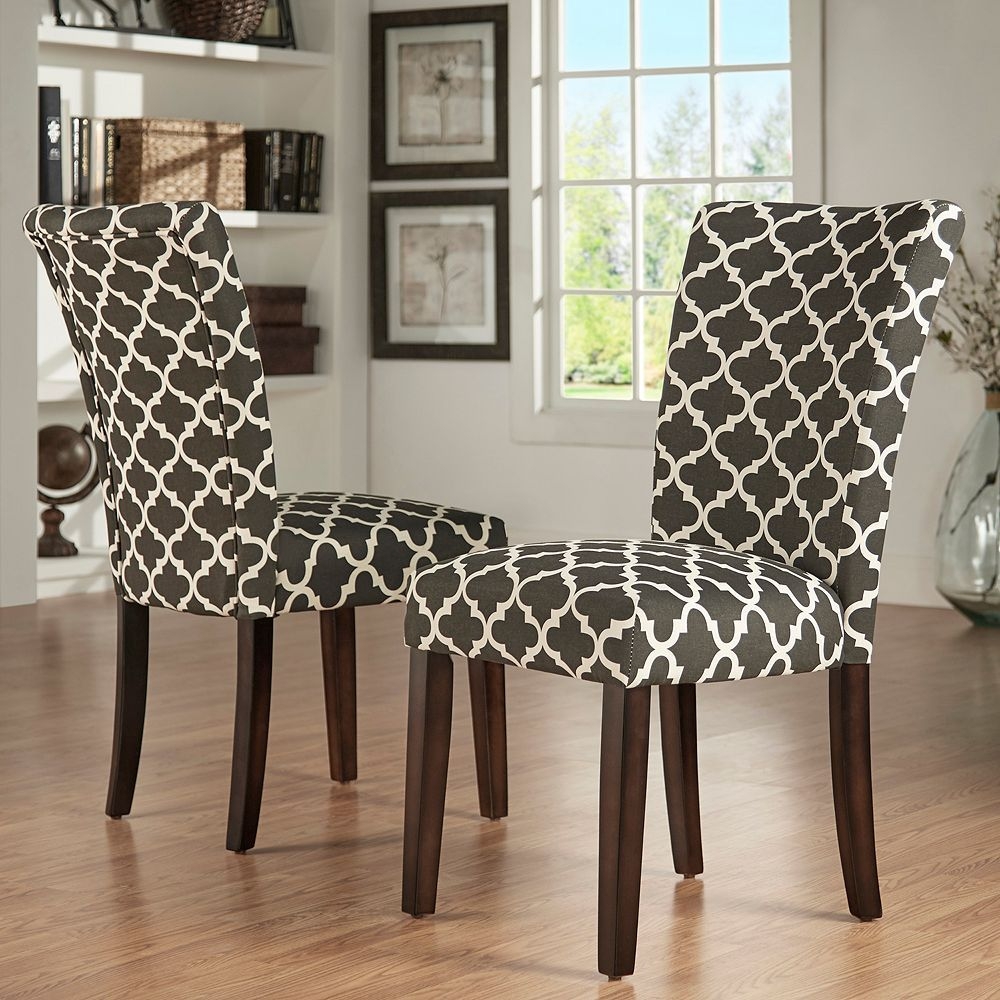
Turquoise and White Dining Room Details
Turquoise and White Dining Room Details
Turquoise and White Dining Room Details
Turquoise and White Dining Room Details
Turquoise and White Dining Room Details
Turquoise and White Dining Room Details
Turquoise and White Dining Room Details
Turquoise and White Dining Room Details
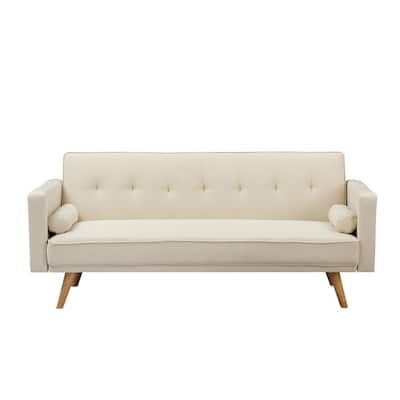
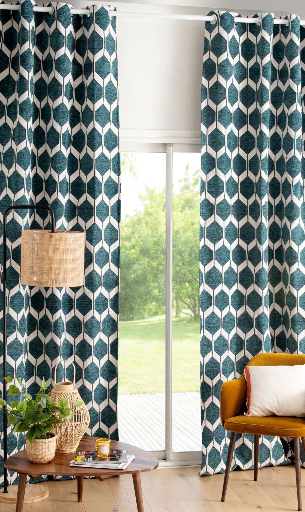
Turquoise + Yellow
Turquoise is a combination of blue and yellow, therefore it carries the same energy as yellow. Turquoise and yellow are both vibrant colors so they must be balanced correctly in a room. The secret to combining these colors is to use the 60-30-10 rules. Start with neutral colors at 60% then add in yellow at 30% and use turquoise as your accent color at 10%.
Shop The Look

Turquoise and Yellow Room Details
Turquoise and Yellow Room Details
Turquoise and Yellow Room Details
Turquoise and Yellow Room Details
Turquoise and Yellow Room Details
Turquoise and Yellow Room Details
Turquoise and Yellow Room Details
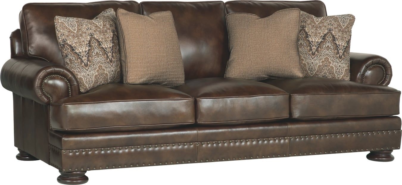
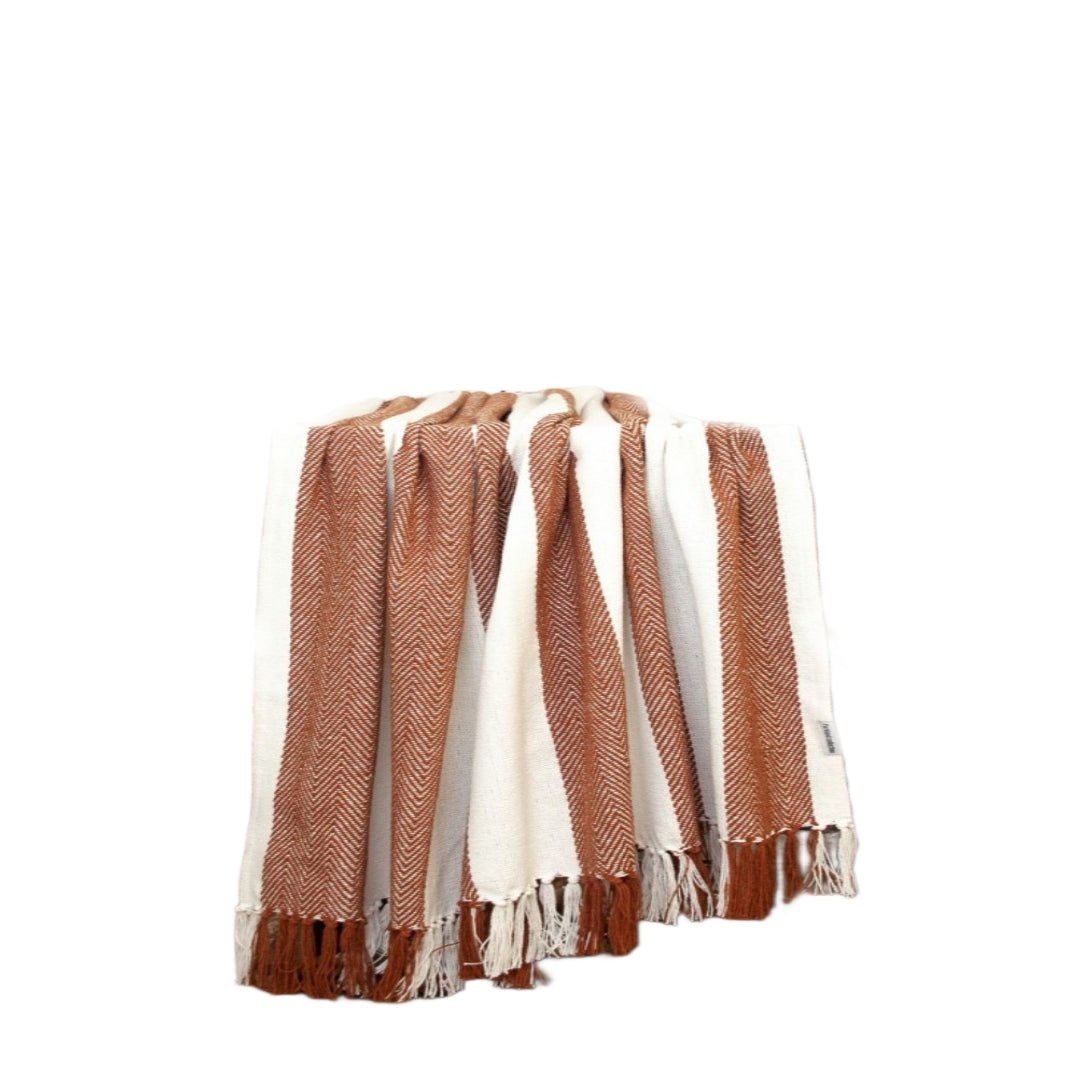
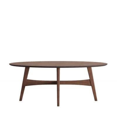
Turquoise + Brown
The rich tones of brown are a nice contrast to the energy of turquoise. Add turquoise throw pillows to a brown sofa to brighten up the room. In rooms with dark brown furniture, try painting the walls a soft turquoise. The turquoise will help visually lighten the heaviness of the furniture.

Shop The Look
Turquoise and Brown Living Room Design
Turquoise and Brown Living Room Design
Turquoise and Brown Living Room Design
Turquoise and Brown Living Room Design
Turquoise and Brown Living Room Design
Turquoise and Brown Living Room Design
Turquoise and Brown Living Room Design
Turquoise and Brown Living Room Design
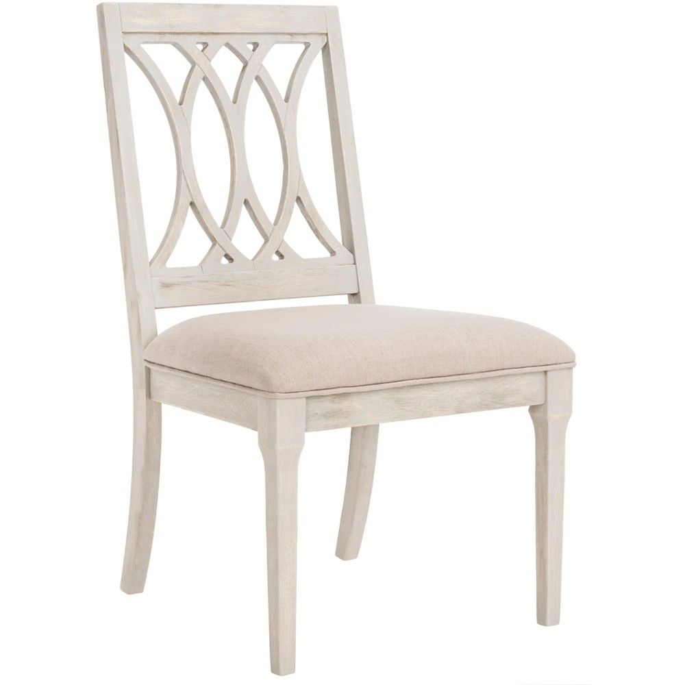
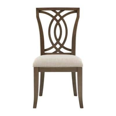
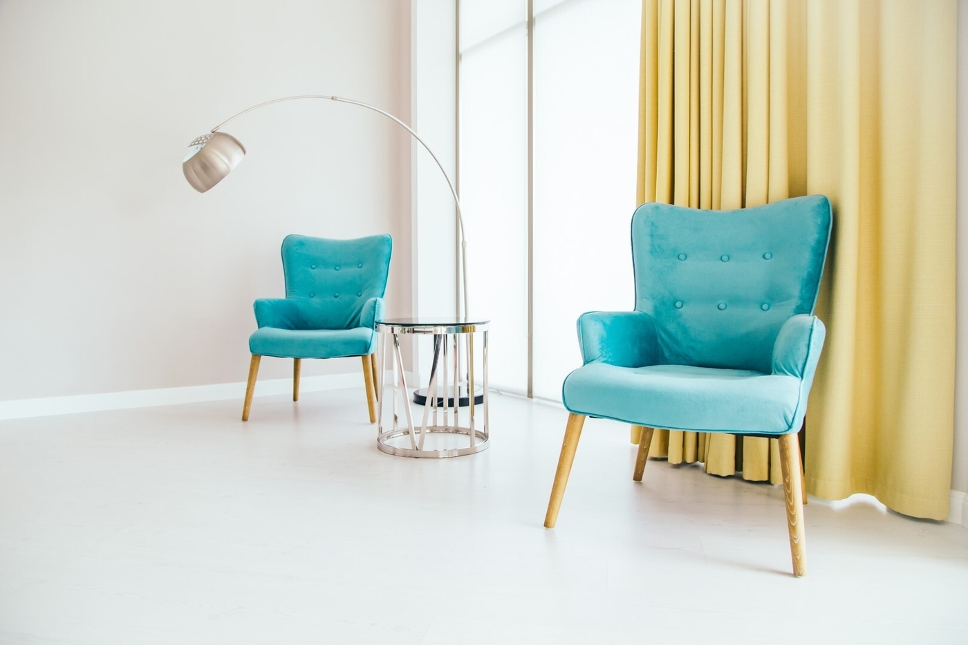
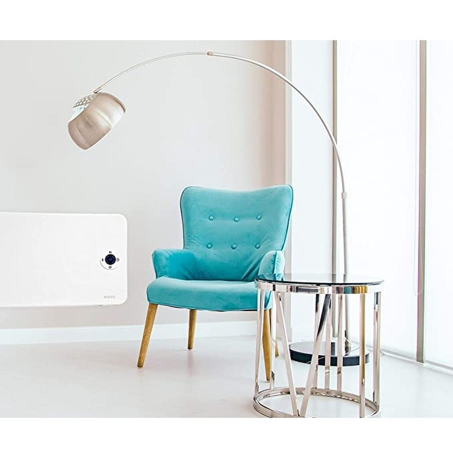
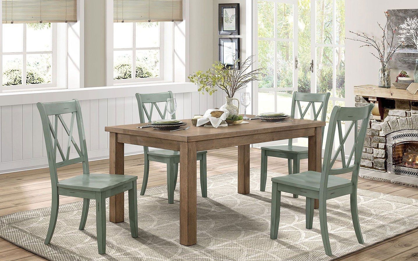
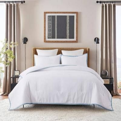
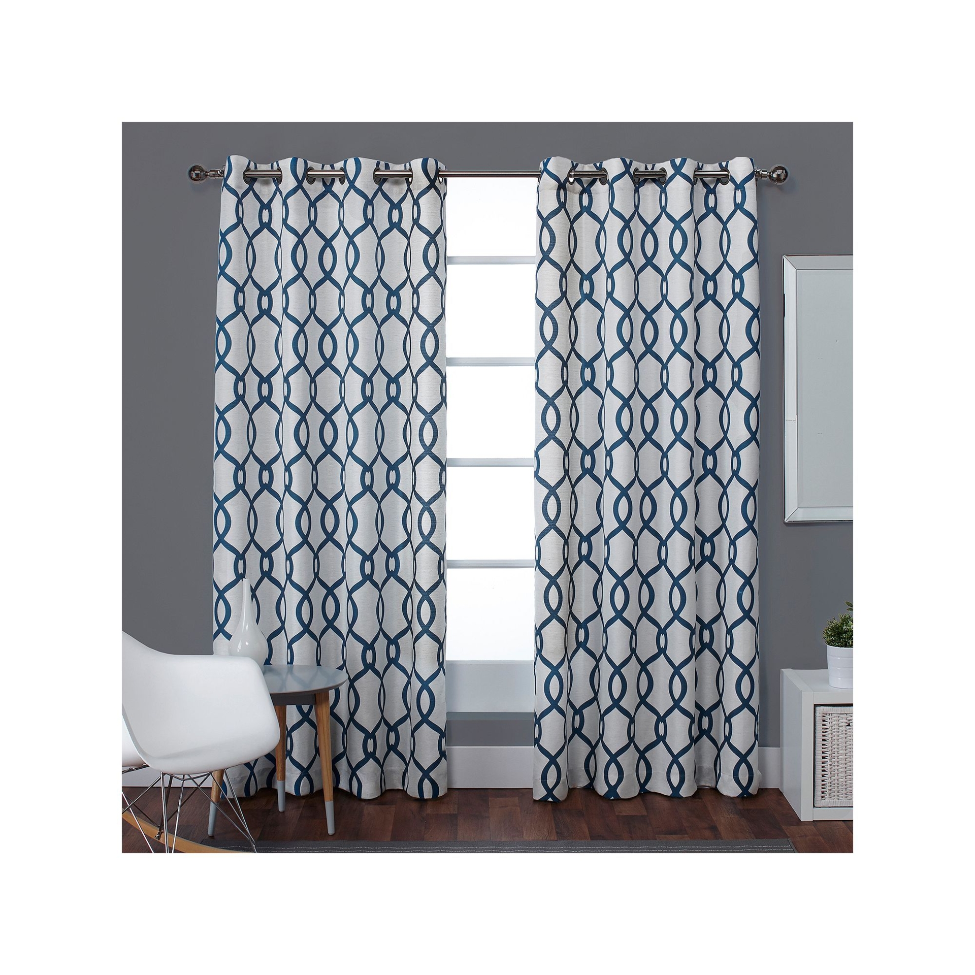
Turquoise + Light Blue
Turquoise and light blue are a fun yet calming combination. Since they both have the tranquility of blue, turquoise and light blue create spaces that are relaxing. However, the vibrancy of turquoise is a nice juxtaposition to the calmness of light blue. Use light blue as the foundation of the room such as the wall paint and add in turquoise in small pieces of furniture, rugs or accent pillows.

Shop The Look
Turquoise and Light Blue Dining Room Ideas
Turquoise and Light Blue Dining Room Ideas
Turquoise and Light Blue Dining Room Ideas
Turquoise and Light Blue Dining Room Ideas
Turquoise and Light Blue Dining Room Ideas
Turquoise and Light Blue Dining Room Ideas
Turquoise and Light Blue Dining Room Ideas
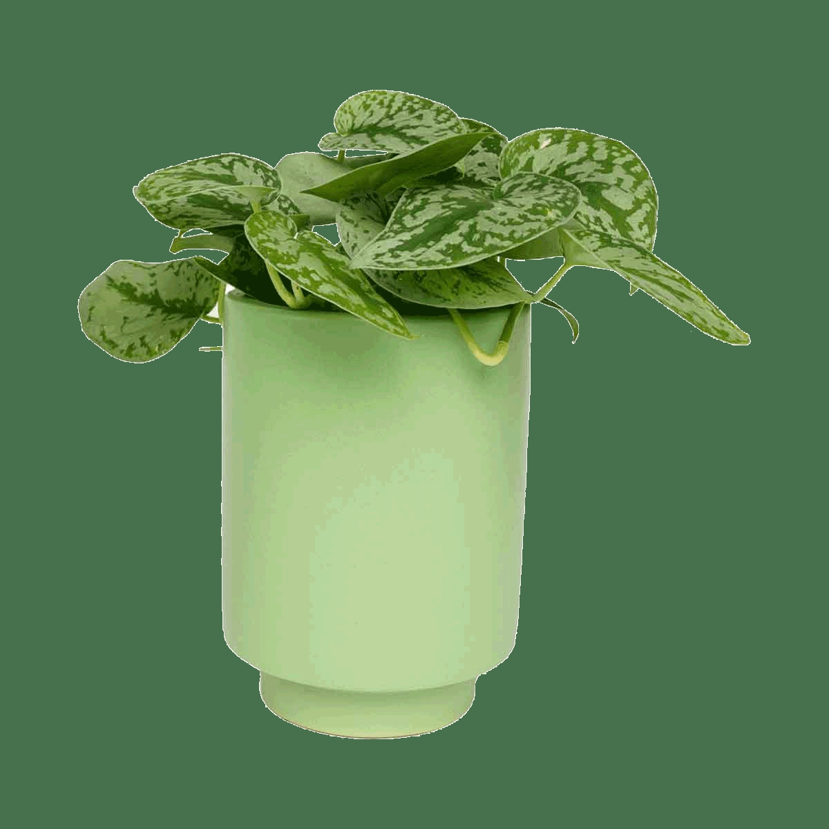
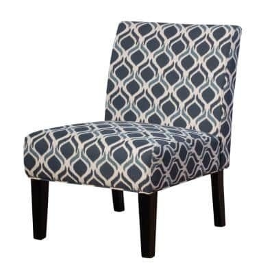
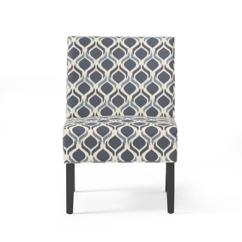
Turquoise + Green
Turquoise and green are analogous colors. Balance the energy and vibrancy of turquoise with lighter shades of green. Turquoise and green can be used as accent colors in neutral spaces or for a bit more boldness paired as the main colors in a room. Select a richer shade of turquoise for the wall color and add in soft shades of green like mint and sage. Try using a painted piece of furniture to incorporate green.

Shop The Look
Turquoise and Green Foyer Design
Turquoise and Green Foyer Design
Turquoise and Green Foyer Design
Turquoise and Green Foyer Design
Turquoise and Green Foyer Design

Turquoise and Green Foyer Design
Turquoise and Green Foyer Design
Turquoise and Green Foyer Design
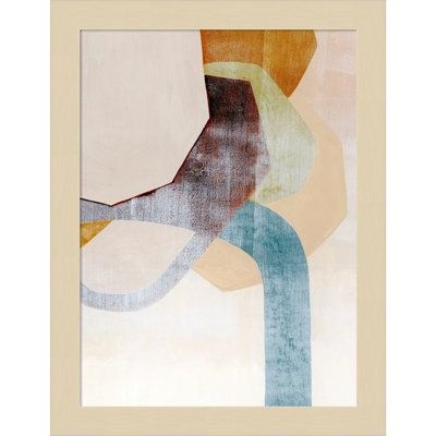
Turquoise + Coral
Turquoise and coral are a bold pairing. The key to getting this duo just right is to mix them with neutrals. Keep the wall paint, rug and furniture neutral. Select artwork, lighting, patterned throw pillows and other small accessories in both colors to add into the space.

Shop The Look
Turquoise and Coral Office Design
Turquoise and Coral Office Design
Turquoise and Coral Office Design
Turquoise and Coral Office Design
Turquoise and Coral Office Design
Turquoise and Coral Office Design
Turquoise and Coral Office Design
Turquoise and Coral Office Design
Turquoise + Gold
Turquoise and gold are a hard duo to get wrong. Turquoise and gold are both warm colors so mix in some cooler colors and neutrals to round out a space. Try using gold accented furniture or lighting, which pops against a turquoise wall or upholstered furniture.

Shop The Look
Turquoise and Gold Bedroom Ideas
Turquoise and Gold Bedroom Ideas
Turquoise and Gold Bedroom Ideas
Turquoise and Gold Bedroom Ideas
Turquoise and Gold Bedroom Ideas
Turquoise and Gold Bedroom Ideas
Turquoise and Gold Bedroom Ideas
Turquoise and Gold Bedroom Ideas
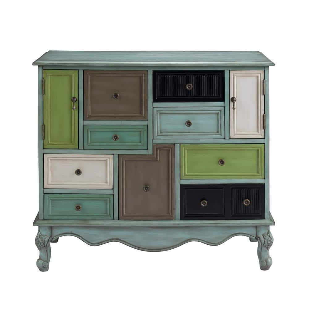
Turquoise + Black
Turquoise and black can both be intense colors, so it is important to balance them correctly in a space. Try using the 60-30-10 rules. Start with neutral colors at 60% then add in turquoise at 30%, finish with black as your accent color at 10%.

Shop The Look
Living Room in Turquoise and Black Details
Living Room in Turquoise and Black Details
Living Room in Turquoise and Black Details
Living Room in Turquoise and Black Details
Living Room in Turquoise and Black Details
Living Room in Turquoise and Black Details
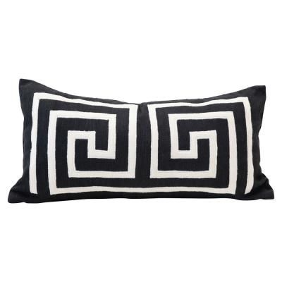
Living Room in Turquoise and Black Details
Living Room in Turquoise and Black Details
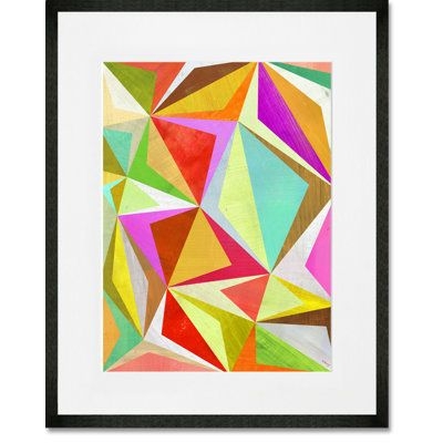
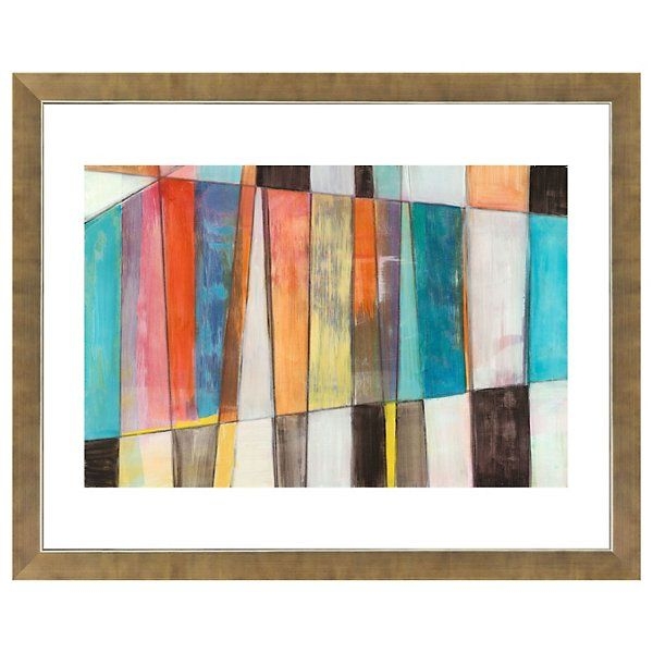
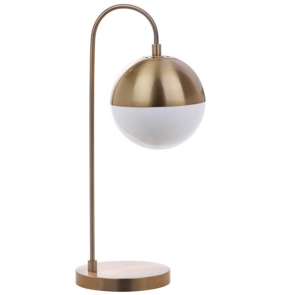
Turquoise + Orange
Turquoise and orange are both energetic colors. It is best to pair these two in a space as accent colors. Start with a foundation of neutral colors on the walls and main pieces of furniture. Add in turquoise and orange in the accessories such as art and decorative pieces. For a bit more punch, add in a small piece of furniture or rug with one of the colors.

Shop The Look
Modern Office in Turquoise nad Orange
Modern Office in Turquoise nad Orange
Modern Office in Turquoise nad Orange
Modern Office in Turquoise nad Orange

Modern Office in Turquoise nad Orange
Modern Office in Turquoise nad Orange
Modern Office in Turquoise nad Orange
Modern Office in Turquoise nad Orange
INTERESTING FACTS ABOUT THE COLOR TURQUOISE:
The name Turquoise means 'Turkish Stone' as it came to Europe from Turkey.
Turquoise is one of the oldest protection amulets and in many ancient cultures was a symbol of wealth and prosperity.
Turquoise stones can change color either by exposure to sunlight or by a chemical reaction brought about by cosmetics, dust or acid.

Caroline Patterson
Caroline is a New York-based interior designer and home decor writer with a strong focus on textiles and designer furniture. Drawing on rigorous training and a deep understanding of material quality and fabric care, she helps readers choose pieces that are both durable and visually refined, turning everyday rooms into cohesive, practical spaces.


