
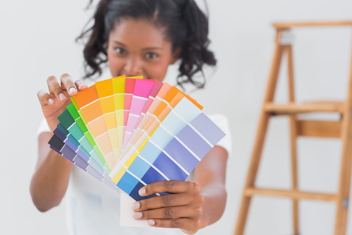
Believe it or not, color clashing is the new trending style. You see people color clashing their clothes, but have you ever seen or heard of color clashing home décor?
With too little clash, your style will go unnoticed. On the opposite side of the spectrum, too much clash can leave your house looking hideously clownish! Below we will show you how to "properly" balance color clashing into your home.
What is Color Clashing?
Shop The Look
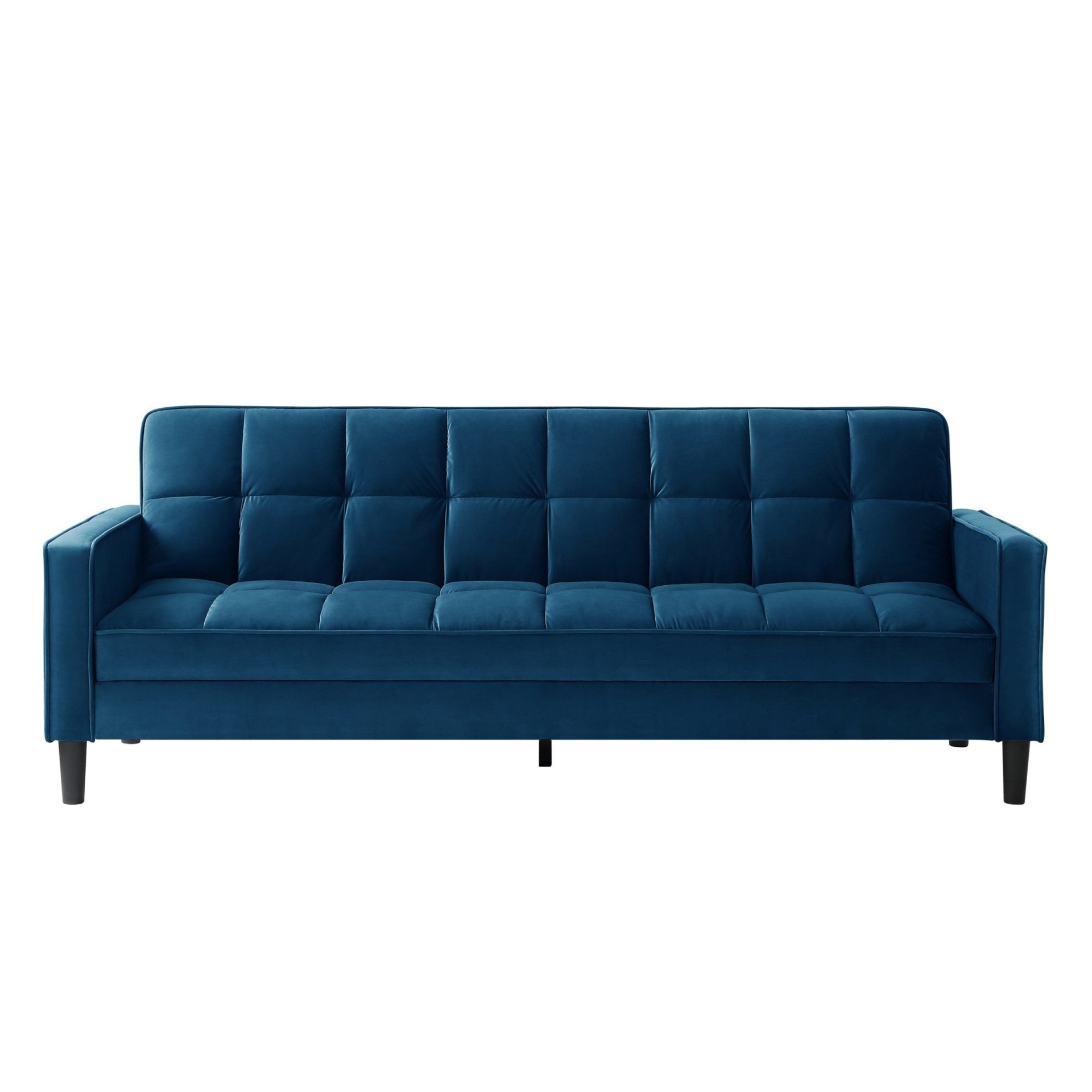
Retro interior
Retro interior
Retro interior
Retro interior
Retro interior
Retro interior
Retro interior
Retro interior
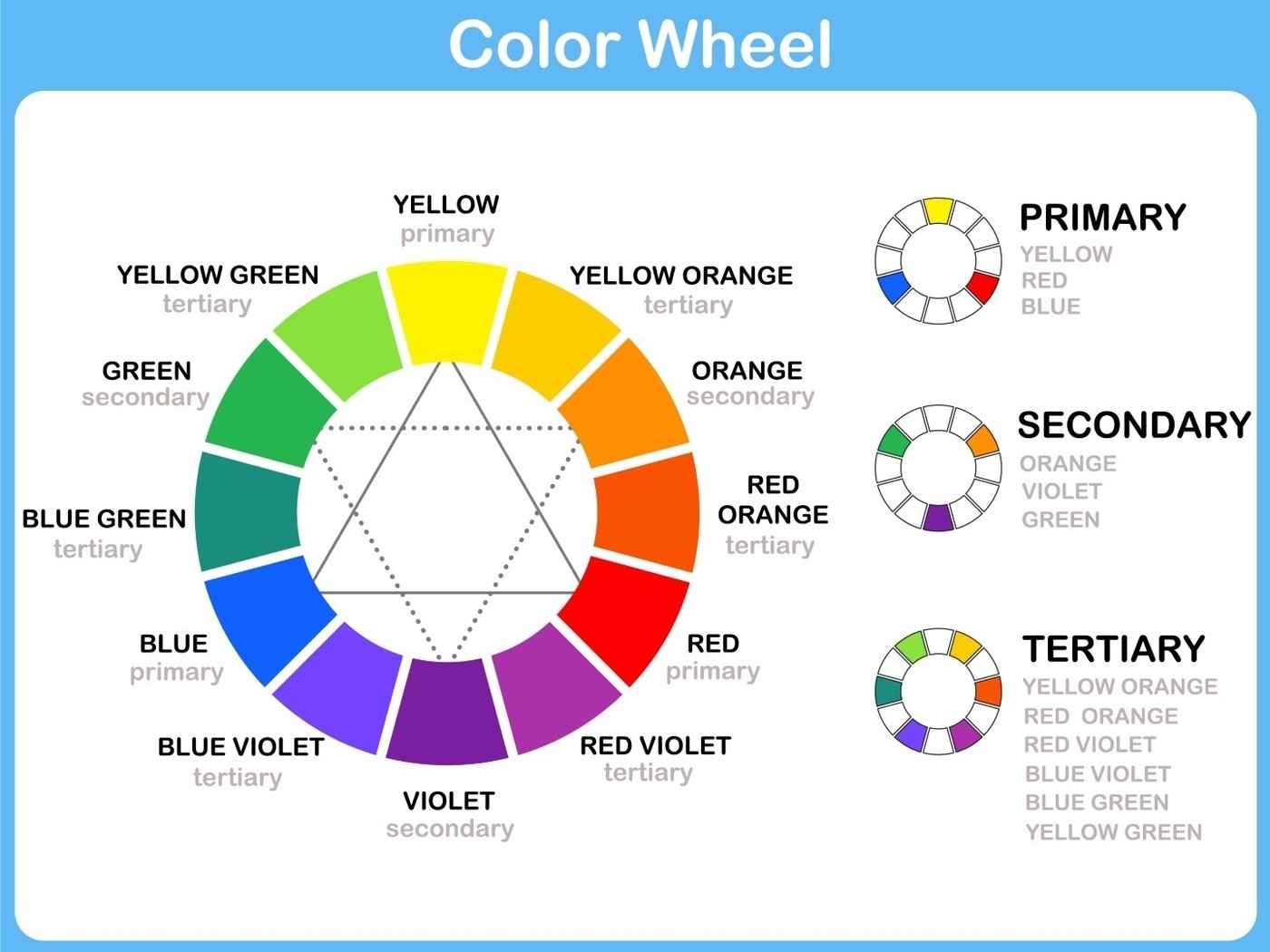
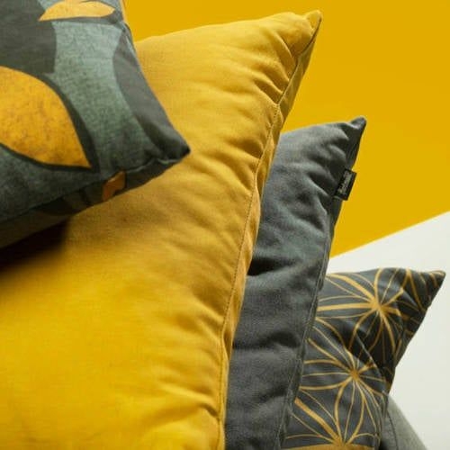
In color clashing, you use contrasting colors or complementary colors on opposite sides of the color wheel to create a high contrasting pairing. If you are thinking of color clashing your home décor, pay attention to three main elements: tone intensity, undertone, and patterns.
Tone Intensity
Harmonious color tone intensities can be quiet with dull tones or loud with bright tones. To color clash home décor properly, keep the same or close to the same tone intensity.
For example, you can choose clashing colors like yellow and purple if you use the same tone intensity. Pair a bright sunny yellow with a bright electric purple or a dull mustard yellow with a dull lavender purple.
Undertone
The best way to explain undertones is by thinking of your skin's undertone. Looking at your forearm, if your veins are green, you have a warm undertone, and if your veins are blue, you have a cool undertone.
Typically, warm with warm or cool with cool are your agreeable undertones. With color clashing, you'll want to mix warm undertones with cool undertonesand cool undertones with warm undertones.
So, this is where the color wheel joins the party. Perfect examples of color-clashing undertones are using colors located on the opposite sides of the color wheel - complementary colors. Combine these warm and cool undertones:
- Red and green
- Red-orange and blue-green
- Orange and blue
- Yellow-orange and blue-violet
- Yellow and violet
- Yellow-green and red-violet
- Navy and black
- Pink and red
- Yellow, red, and blue
- Orange, green, and violet
Patterns
Shop The Look
White retro lounge
White retro lounge
White retro lounge
White retro lounge
White retro lounge
White retro lounge
White retro lounge
White retro lounge
If you are feeling extremely adventurous, then mix color clashing with pattern clashes. Here are some interesting color and pattern clashes you can try at home:
Orange and black plaid armchair with a navy-blue pillow with white pin-point polka dots
Green floral print cottage couch with red and white plaid
White and yellow geometric patterned area rug with a purple and white vine patterned ottoman
What are the Benefits of Color-clashing Home Décor?
Color-clashing bright colors with bright colors are bold and beautiful. It's a great technique for making a specific home décor piece stand out from your other home décor pieces.
If you're into sports, then you know how football teams and other sports teams use color clashing tastefully and attractively. Color-clashing in your home décor can provide you with the same fashion statement as it does in clothes and jerseys.
Examples and Tips on Color-clashing Home Décor
Now that you have the three elements you need to pay attention to, you're ready to start color-clashing your home décor!
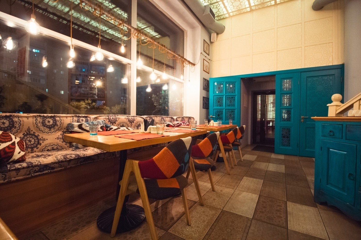
Orange and blue color-clashing dining room
Shop The Look
Blue and orange dining room
Blue and orange dining room

Blue and orange dining room
Blue and orange dining room
Blue and orange dining room
Blue and orange dining room
In this dining room, you have a medium brightness with both the cerulean blue door and orange chairs and napkins. This color-clashing home décor works so well because there is a majority of orange hue with only a splash of blue.
People love balance, but when it comes to balancing your color-clashing home décor, we strongly advise against it. You want more of one color and less of the other. If you try to balance the same amount of each color, you will be left with a clownish appeal.
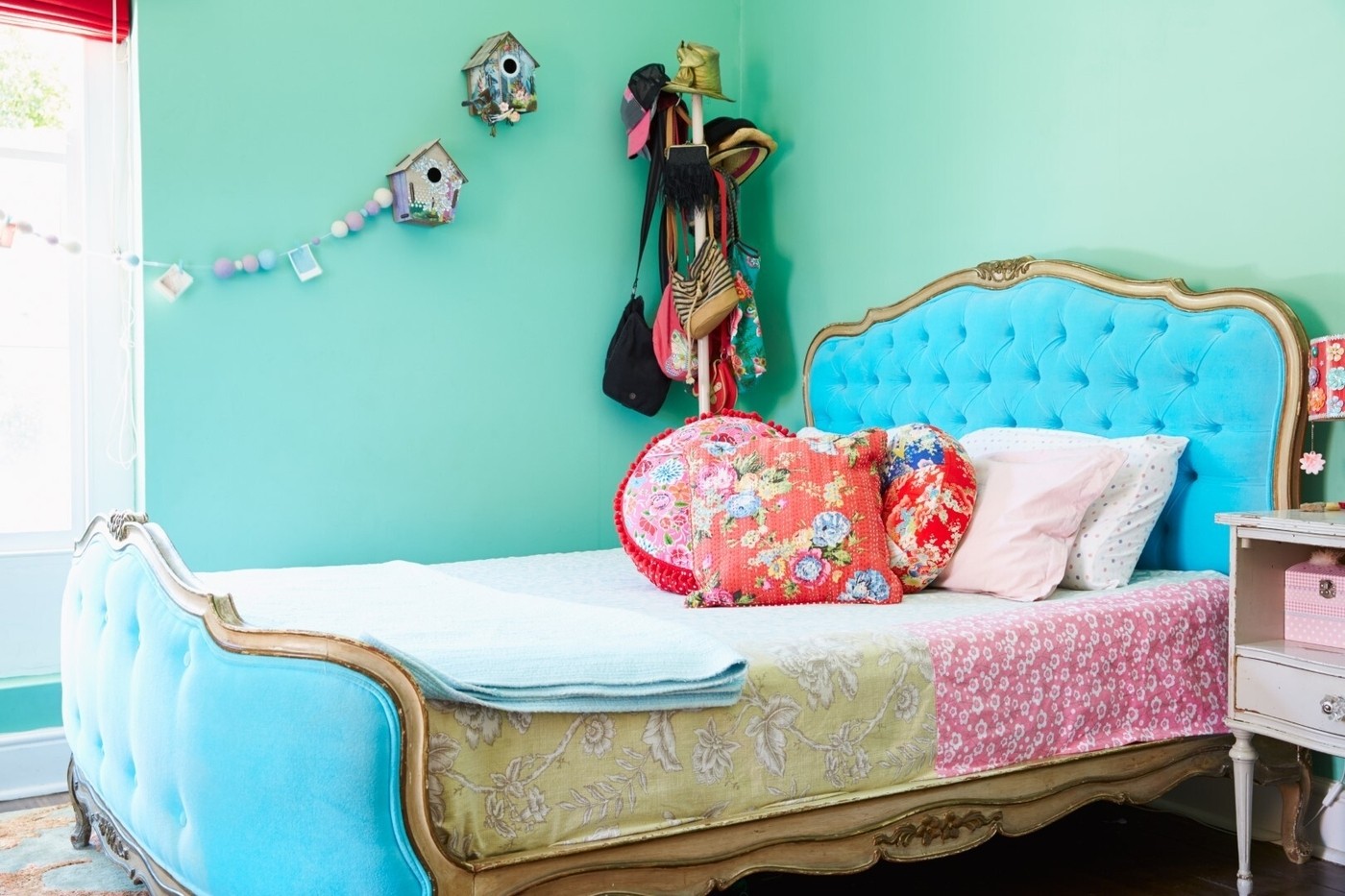
Pattern and assorted color-clashing bedroom
Shop The Look
Stylish bedroom interior
Stylish bedroom interior
Stylish bedroom interior
Stylish bedroom interior
Stylish bedroom interior
Stylish bedroom interior
Stylish bedroom interior
Stylish bedroom interior
The color-clashing in this bedroom is specifically focused on eclectic designers. You have a great mix of multiple clashing colors, with blue and red standing out the most.
This type of patterned and assorted color clashing works because the tone intensity of the blue headboard and red pillows are close to the same. Your other colors fall into a muted and quiet tone, letting your red and blue speak for themselves.
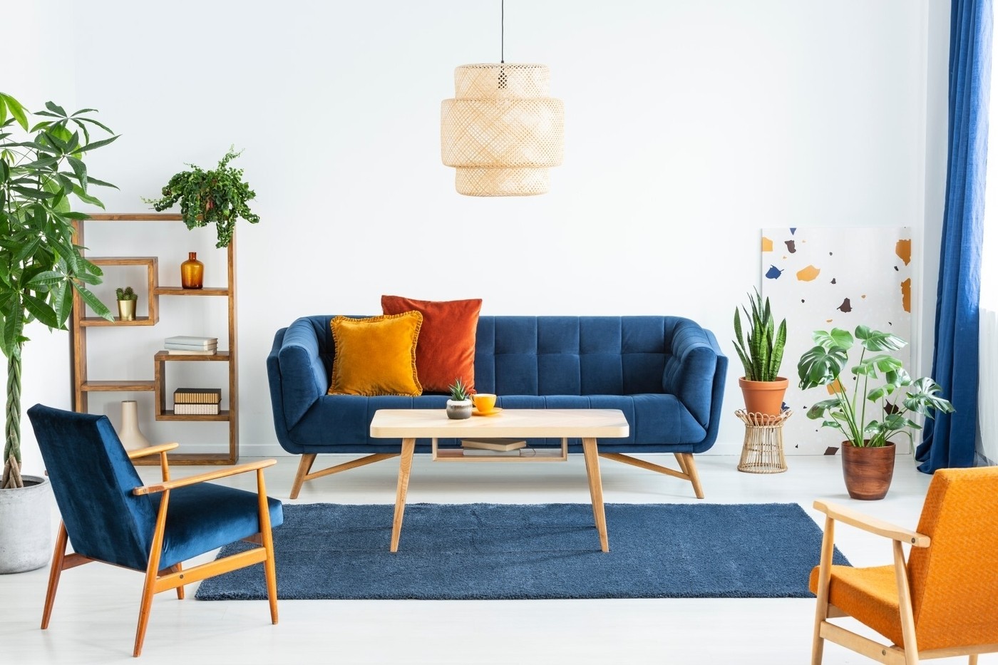
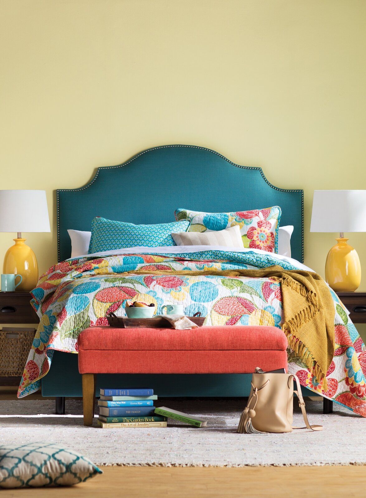
Blue and yellow color-clashing living room
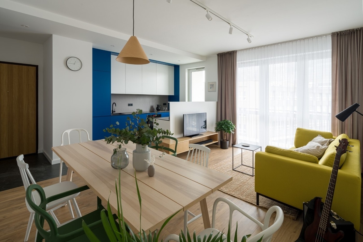
Color-clashing wall colors with furniture is a beautiful design element. Use yellow and blue color-clashing in mid-century, Bohemian, coastal, modern, and contemporary design.
In this home décor, the color-clashing of blue and yellow works because they aren't right on top of each other. There is a decent amount of space between the wall and couch, and the room offers natural tones that blend the design together.
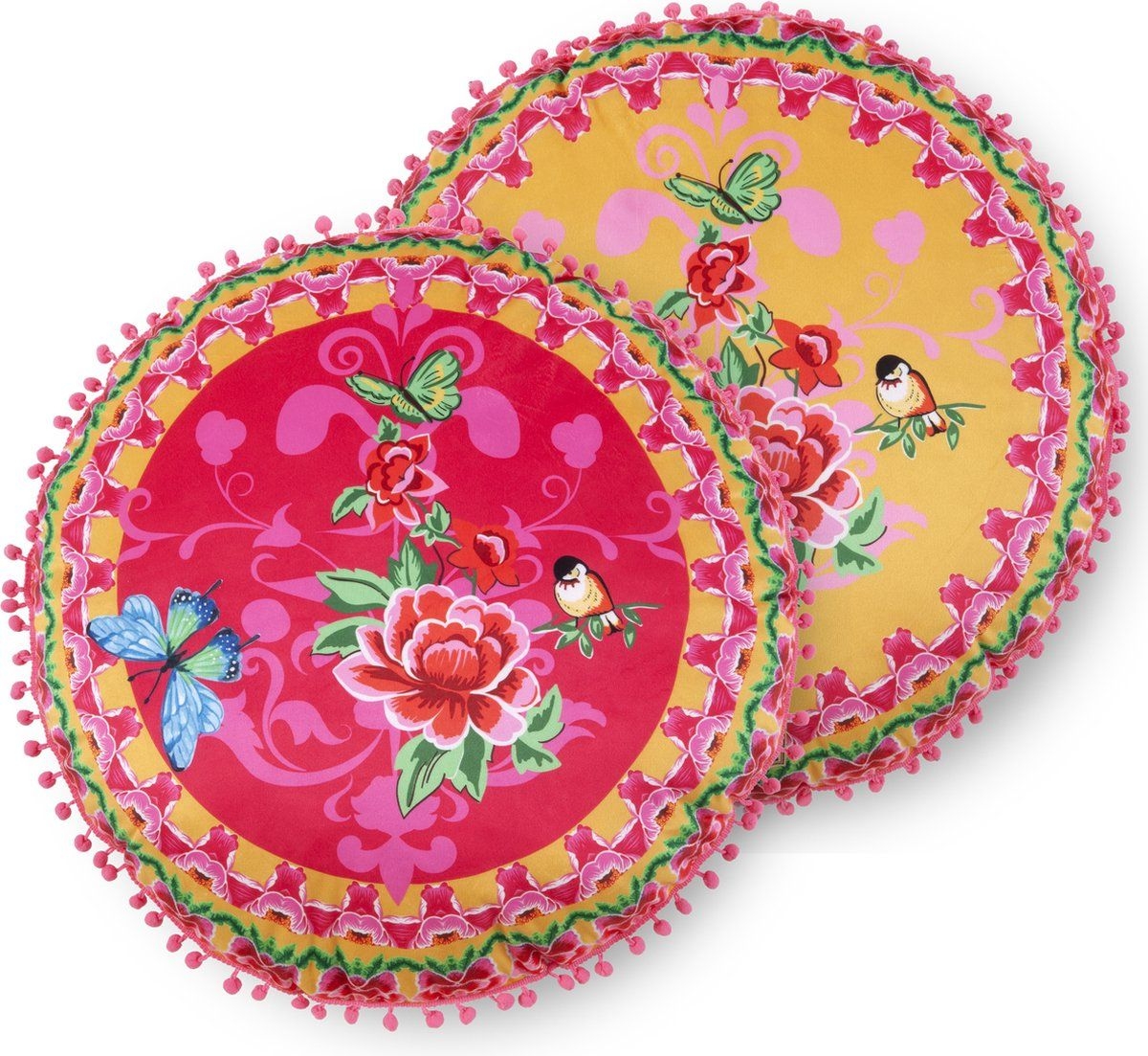
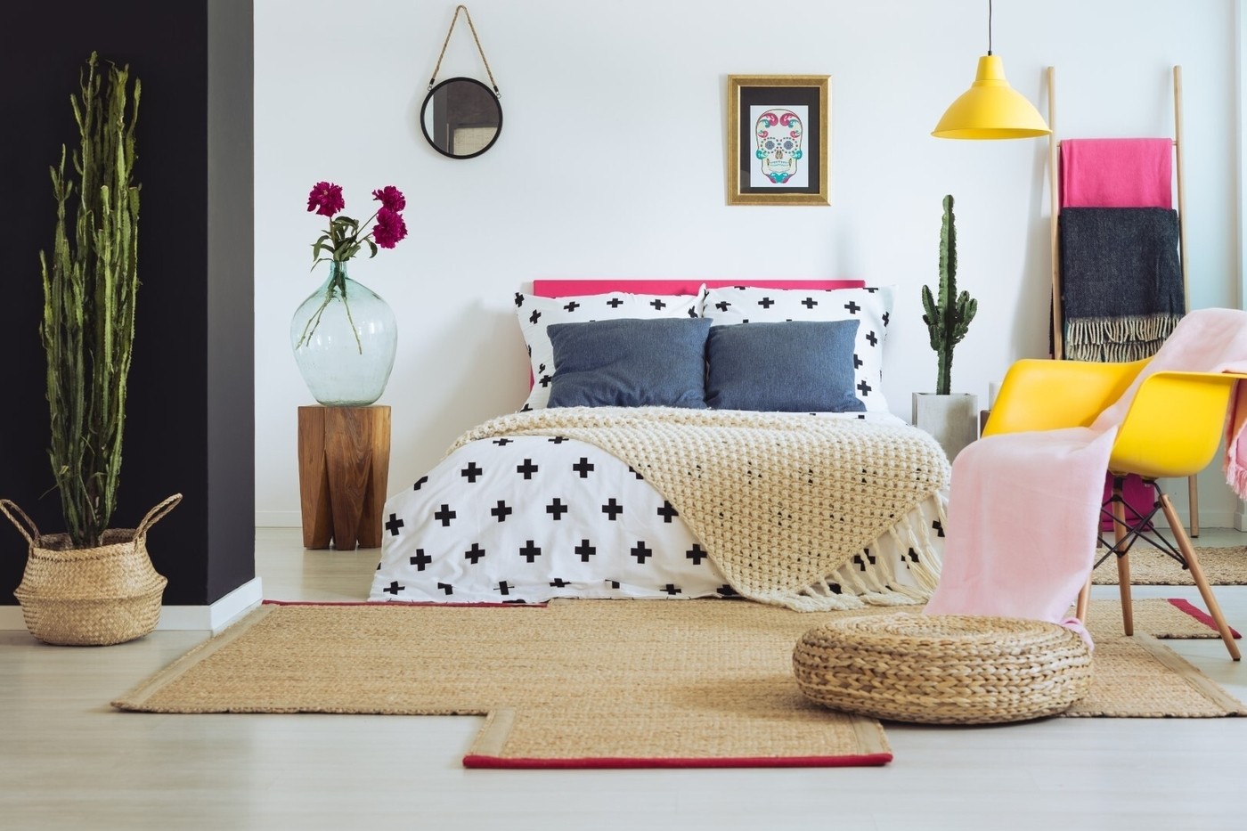
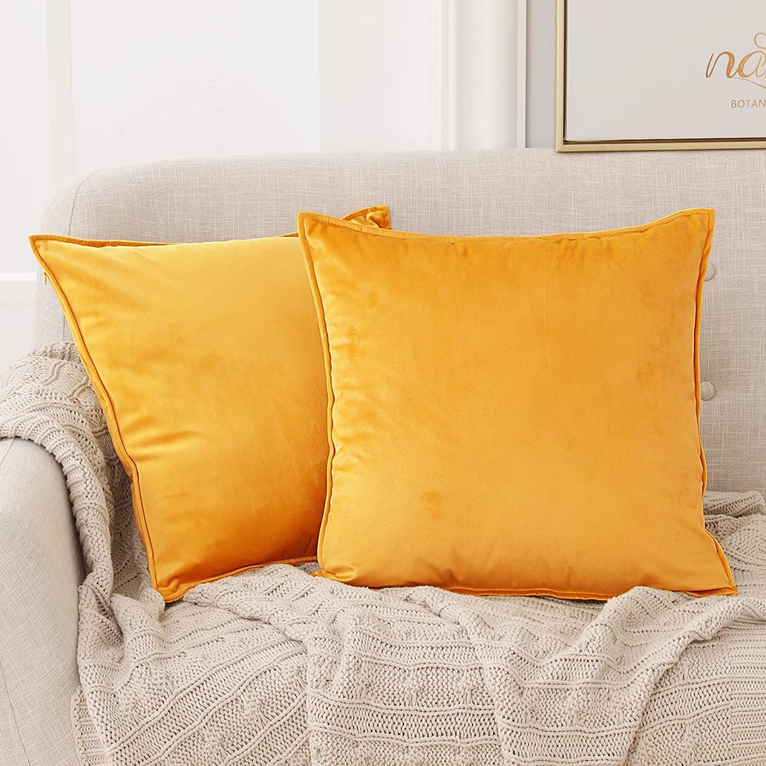
Yellow and pink color-clashing bedroom
Shop The Look
Mexican decor
Mexican decor
Mexican decor
Mexican decor
Mexican decor
Mexican decor
Mexican decor
Mexican decor
Accenting a bedroom with bright yellow and bright pink adds a feminine color-clashing touch. If the home décor were changed slightly with just light muted pink and bright sunny yellow, your room would be in for a disaster!
The added textures and small bits of pattern help with room flow and design. The muted grey-blue pillows prevent your bright warm yellow and pink from consuming the bedroom.
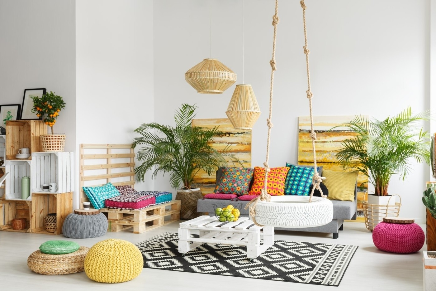
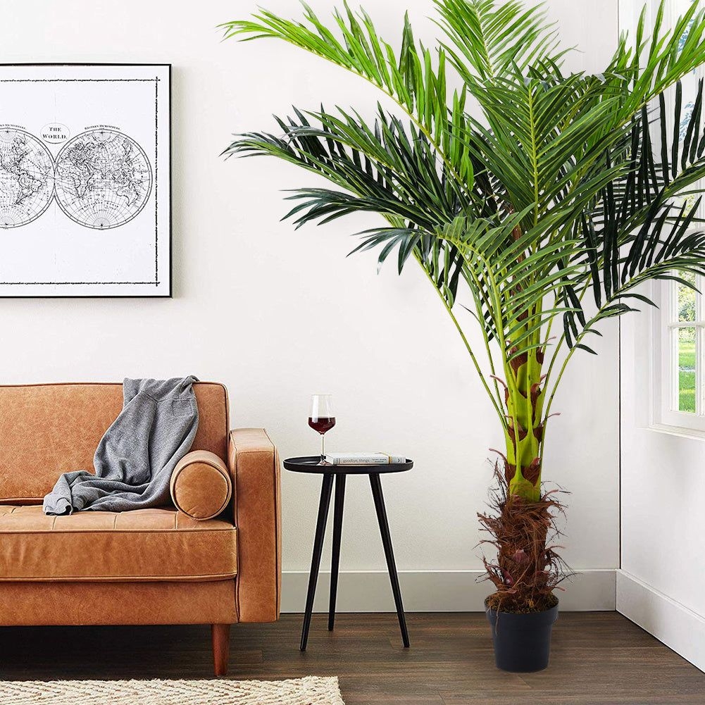
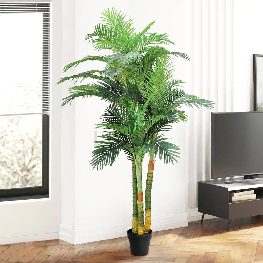
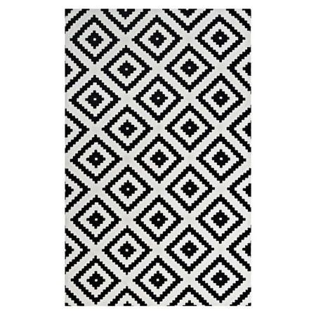
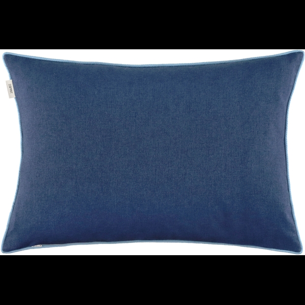
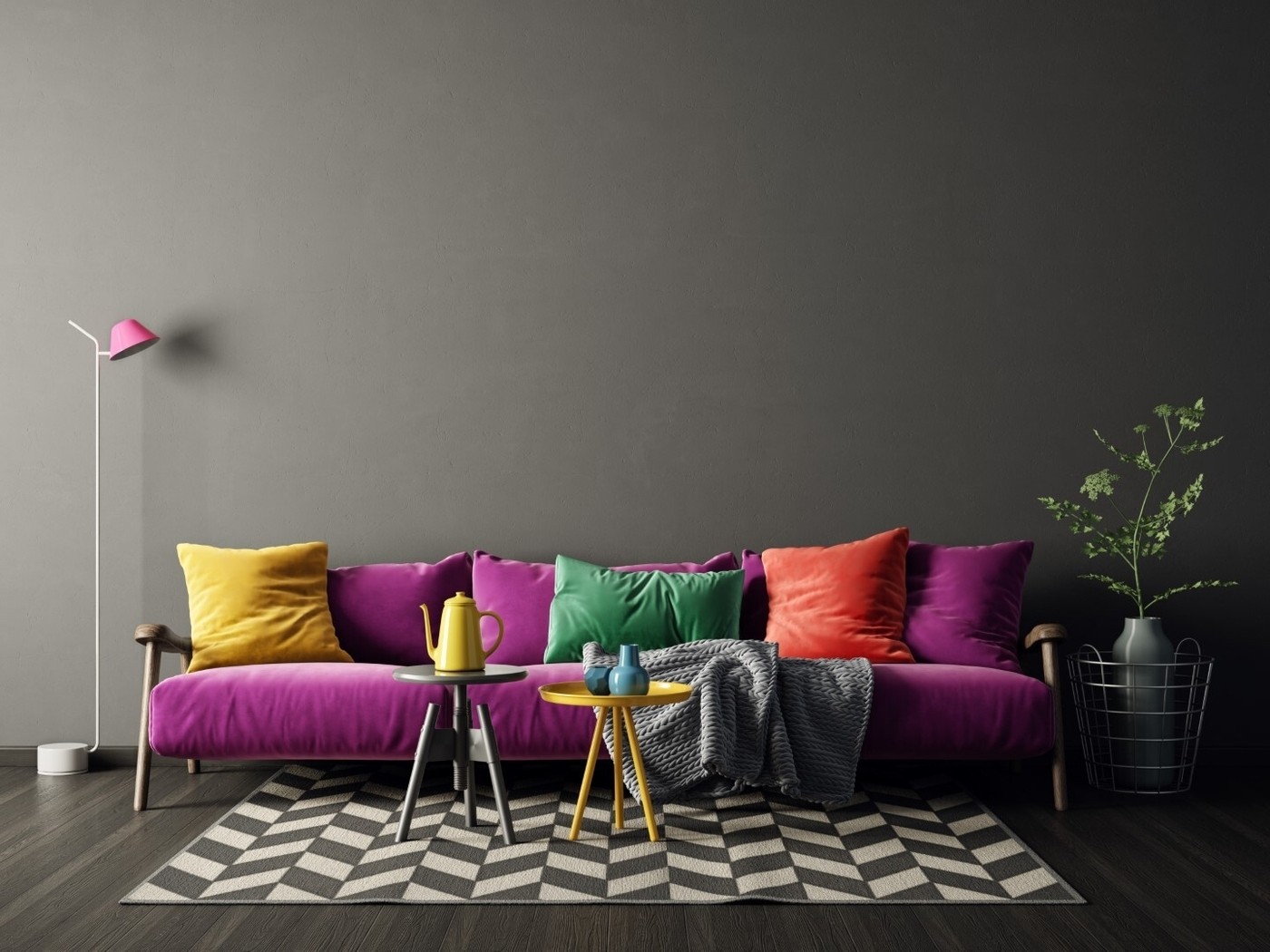
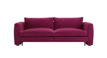
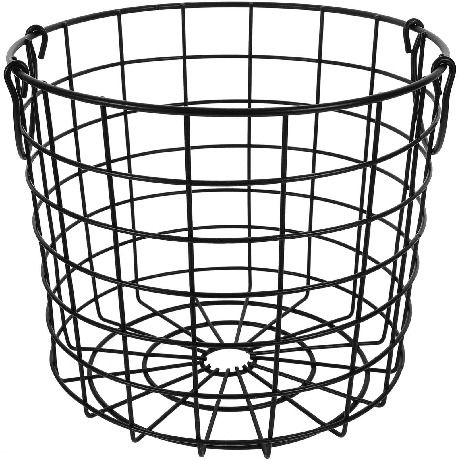
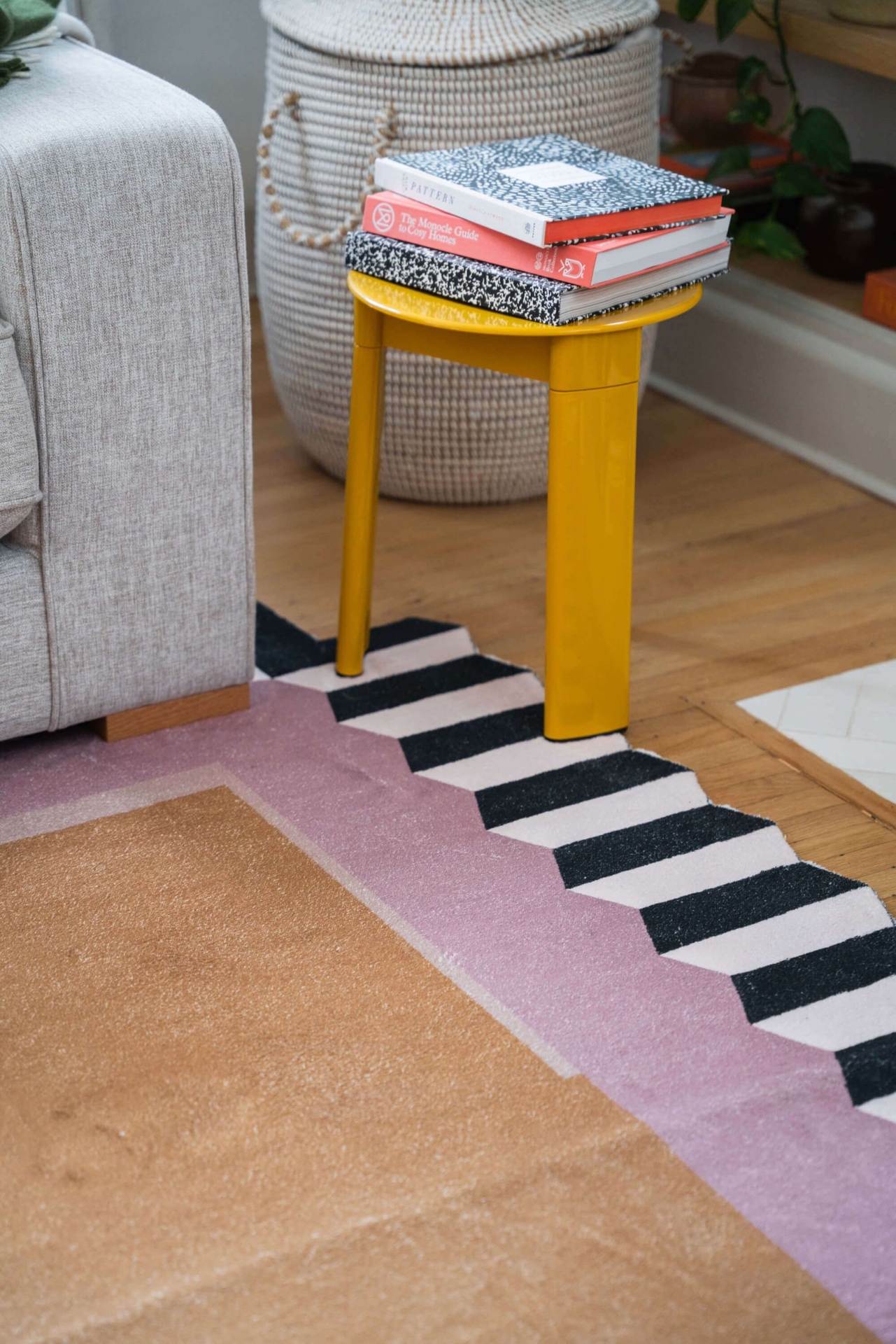
Purple and yellow color-clashing living room
Shop The Look
Purple and yellow room
Purple and yellow room
Purple and yellow room
Purple and yellow room
Purple and yellow room
Purple and yellow room
Purple and yellow room
Purple and yellow room
You can tell whoever designed their color-clashing couch wanted the couch to stand out for itself. The grey-brown walls and floor drift into the background, while your bright purple couch and bright color clashing pillows pop.
To prevent the design from falling flat, this living room includes a patterned black and white rug that provides movement in the darkroom. The addition of a plant or tree to this room elevates the design to prevent it from looking too "cartoony."

Caroline Patterson
Caroline is a New York-based interior designer and home decor writer with a strong focus on textiles and designer furniture. Drawing on rigorous training and a deep understanding of material quality and fabric care, she helps readers choose pieces that are both durable and visually refined, turning everyday rooms into cohesive, practical spaces.


