
It's happened to the best of us. You've spent months comparing paint swatches and shopping for furnishings, but when all is said and done, your space still looks and feels… underwhelming. Fortunately, there are some minor tweaks you can make to your interior spaces that will make a big difference. We get into six of those decorating corrections below.
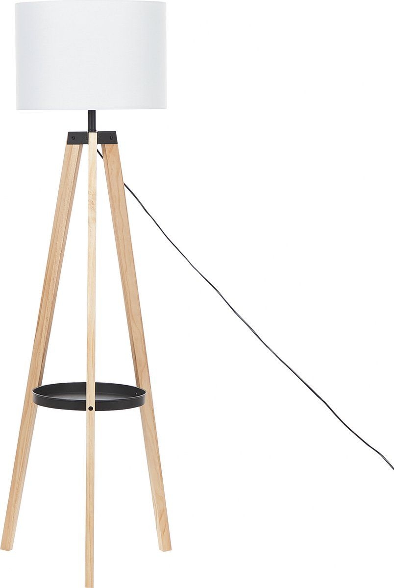
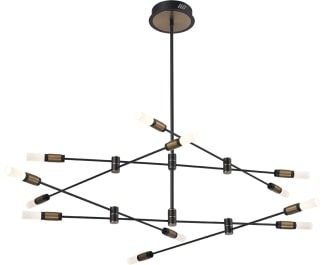
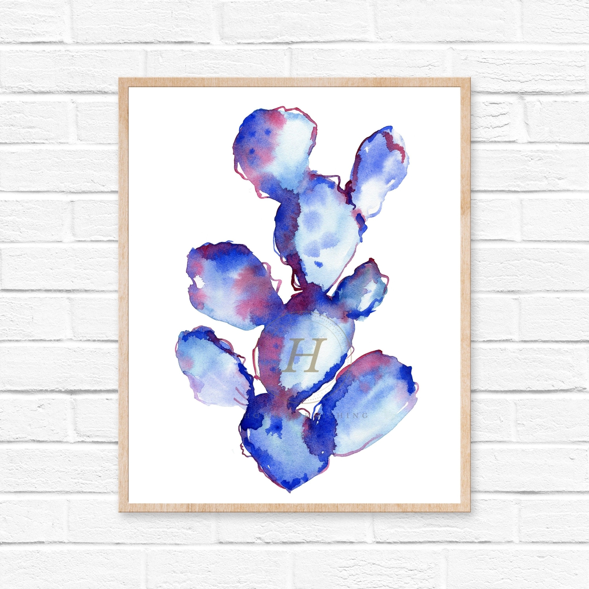
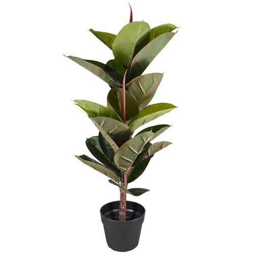
Shop The Look
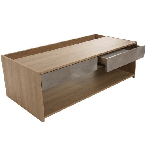
Interior decoration
Interior decoration
Interior decoration
Interior decoration
Interior decoration
Interior decoration

Interior decoration
Interior decoration
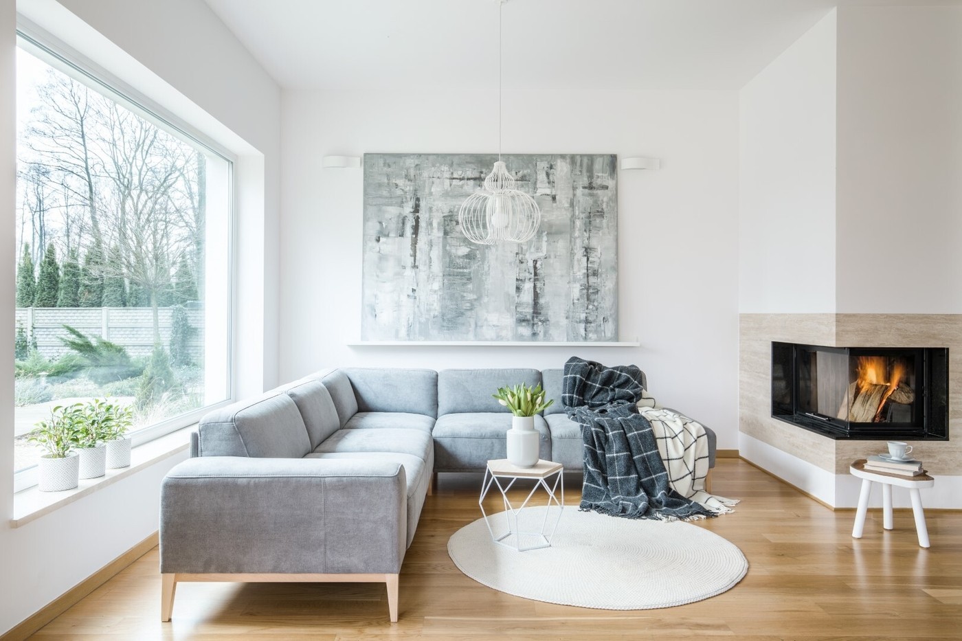
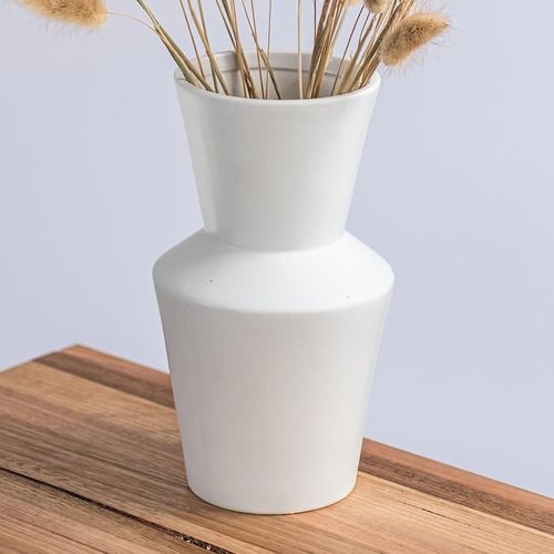
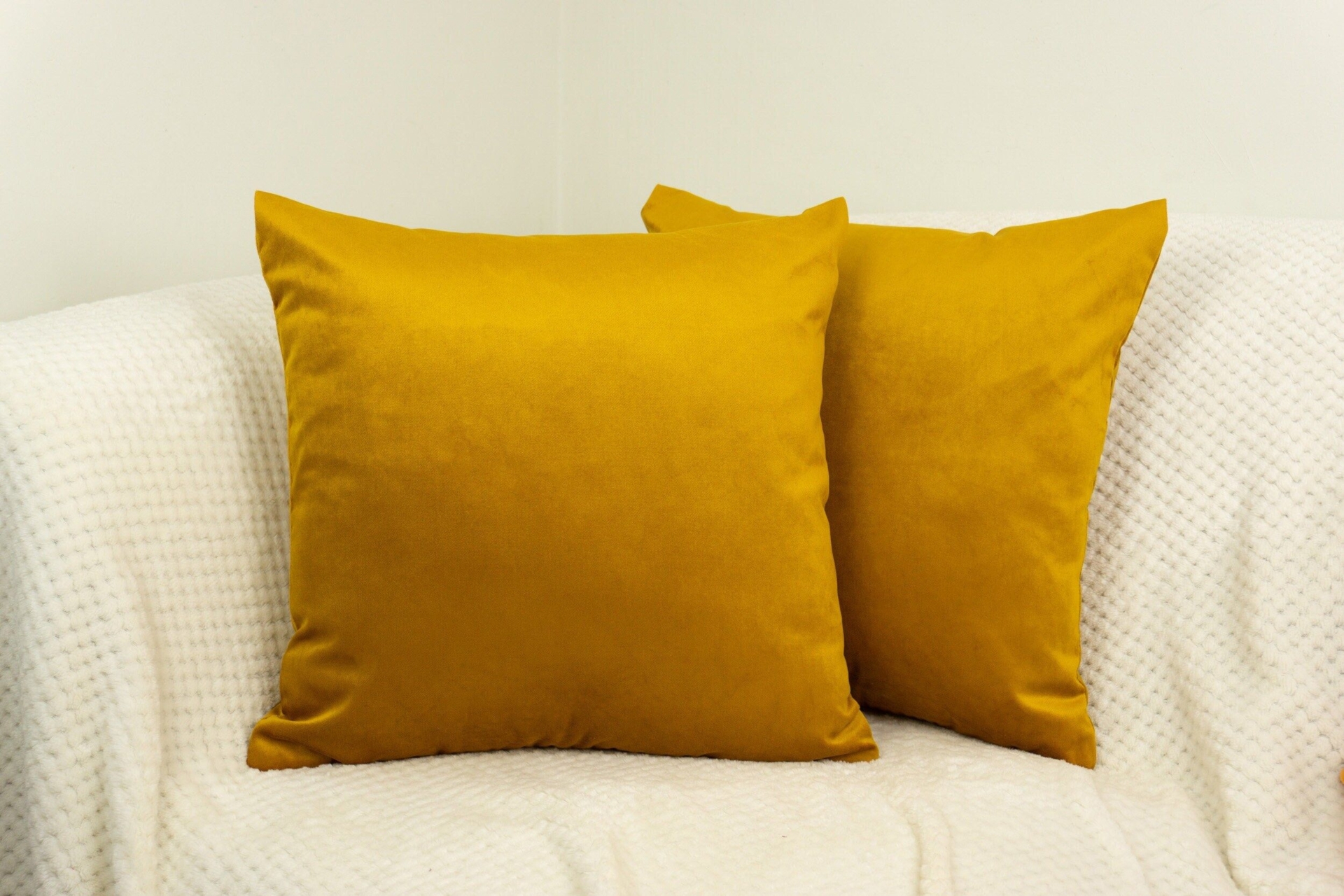
Overusing mid-tones
Many of us are naturally attracted to mid-tones (also known as medium colors). Mid-tones fall somewhere in between light and dark colors and are softer on the eye than stark white or a more saturated color, for example. In rooms that we associate with resting and relaxing, such as the bedroom or living room, muted mid-tones tend to be a common and appropriate choice. That said, using too many creamy mid-tones can result in a space that looks flat and lacks contrast.
Fixes:
- Introduce a warmer or cooler color temperature through paint, furnishings, or accessories.
- Introduce a textural element, such as a plush throw, high pile rug, or plant, to break up the monotony of mid-tones.
- Add a light fixture that casts a warm or cool temperature to bring out variations in color undertones.
Shop The Look
White interior of the living room
White interior of the living room
White interior of the living room
White interior of the living room
White interior of the living room
White interior of the living room
White interior of the living room
White interior of the living room
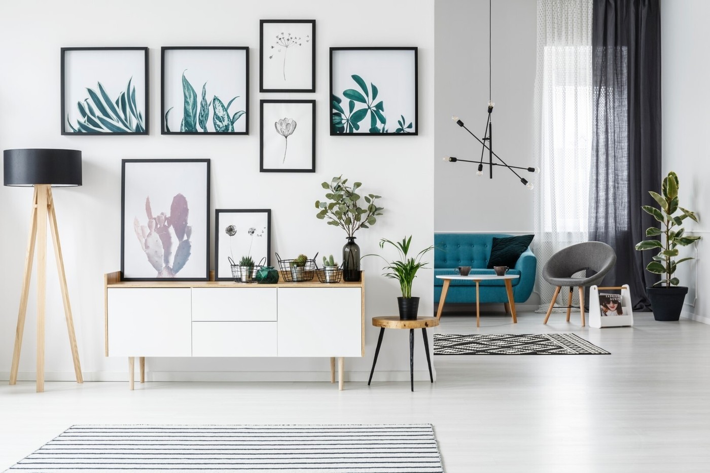
Under-using negative space
Negative space is an extremely important component of a well-designed interior and it serves a few purposes. Defined as the "empty space" or the space and areas around objects, negative space can be used to make your decorative choices really pop. It can also be used to create a sense of visual balance in a room and keep it from looking overcrowded. And finally, negative space can be used to guide traffic flow. Conversely, a lack of negative space can lead to your interiors looking cluttered, visually overstimulating, and off-putting.
Fixes:
- When determining whether a room needs more or less negative space, stand back and view the space from a distance.
- Display bold artwork, furnishings, and ornaments against a backdrop of clean, white wall. This will give those statement pieces visual hierarchy.
- Float furniture away from the walls to facilitate traffic flow surrounding the piece.
- Add negative space in an asymmetric manner to prevent your interiors from looking too predictable.
Shop The Look
Art on a white wall
Art on a white wall
Art on a white wall
Art on a white wall
Art on a white wall
Art on a white wall
Art on a white wall
Art on a white wall
TIP: Too much negative space will cause your space to feel unfinished and underwhelming. Balance is key. If you're noticing that certain spots in your home are looking bare and monotonous, consider adding a tall plant, leaning a mirror, or mounted cabinetry to spice up the space.
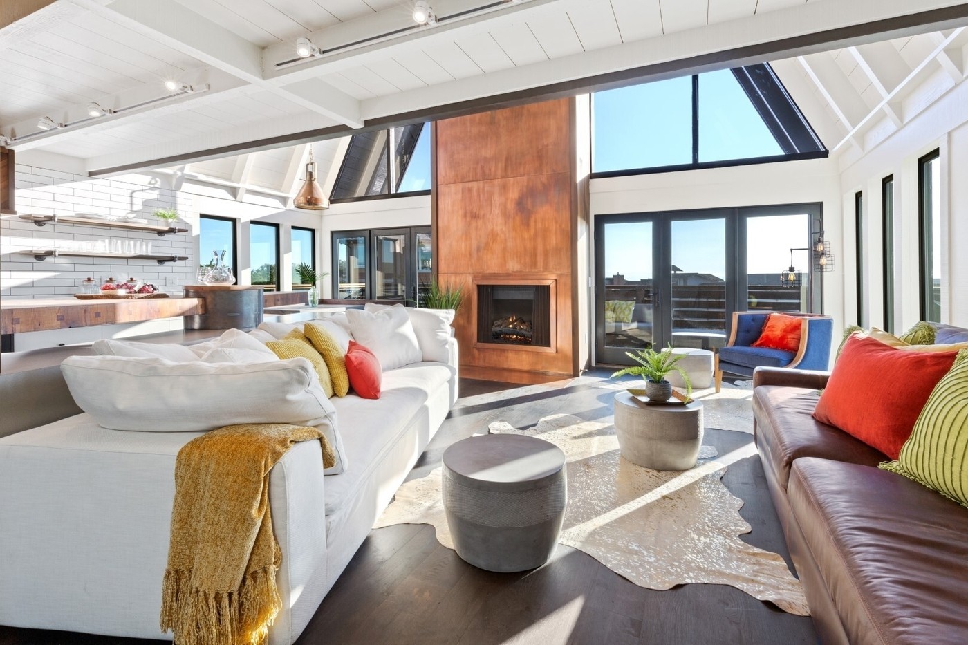
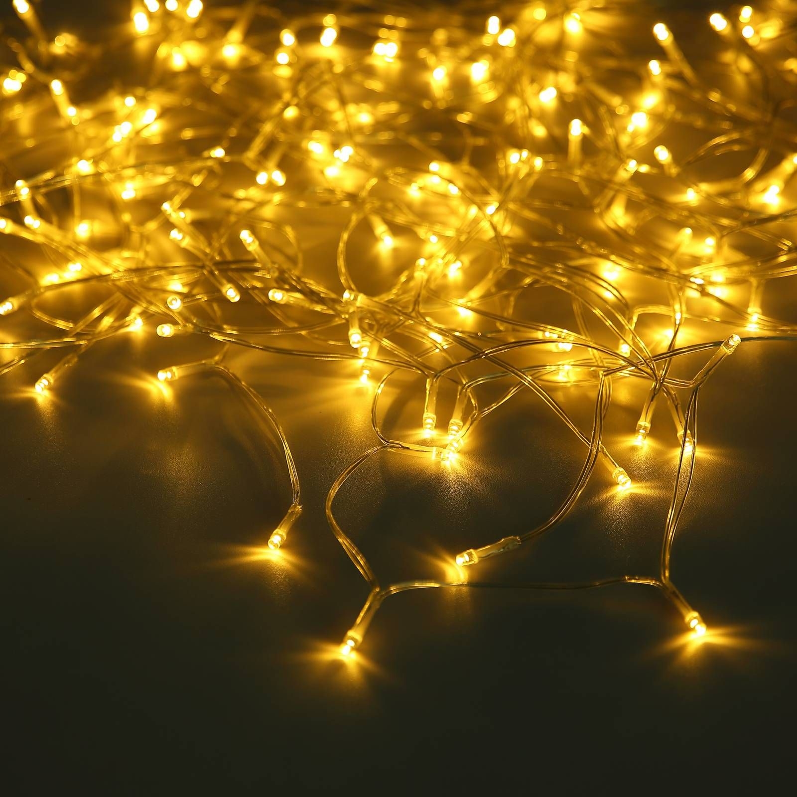
Not enough lighting
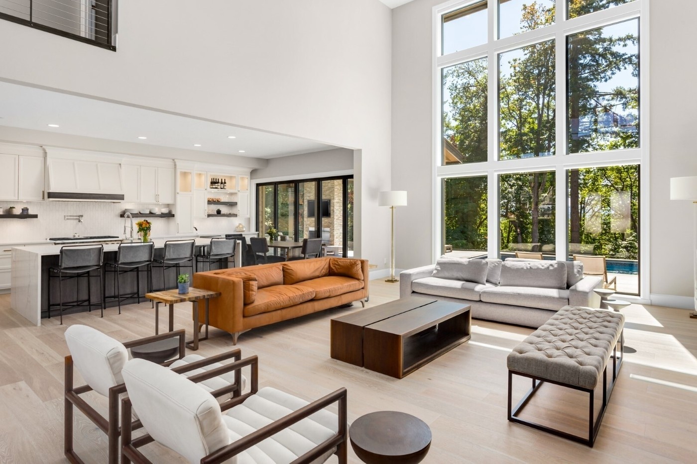
In interior design, light is especially important because colors tend to present differently when exposed to varying degrees of light. In other words, if you're finding that a certain paint or fabric color is looking different in your home than it did in the store, improper lighting may to be blame. In addition, lighting lends depth, dimension, and height to interior spaces, so without proper lighting, you risk your space looking and feeling smaller than it actually is.
Fixes:
- Whenever possible, invite natural light into your home. In some cases, this means skipping the heavy, opaque window treatments and opting for a sheer piece instead. You can also consider skipping the window treatments altogether.
- Lighting your home is all about layering. In conjunction with natural light, use a combination of ambient, task, and accent lighting to properly illuminate your space.
- Use mirrors and metallics to amplify light while adding a sense of movement and richness to the space.
- If you're working with a small space, utilize recessed light fixtures, such as pot lights and under cabinet fixtures, which will add light without encroaching on space.
- If you're using dark colors in your space, you'll probably need more lighting to reveal the richness and complexity of those colors.
Shop The Look
Luxury home
Luxury home
Luxury home
Luxury home
Luxury home
Luxury home
Luxury home
Luxury home
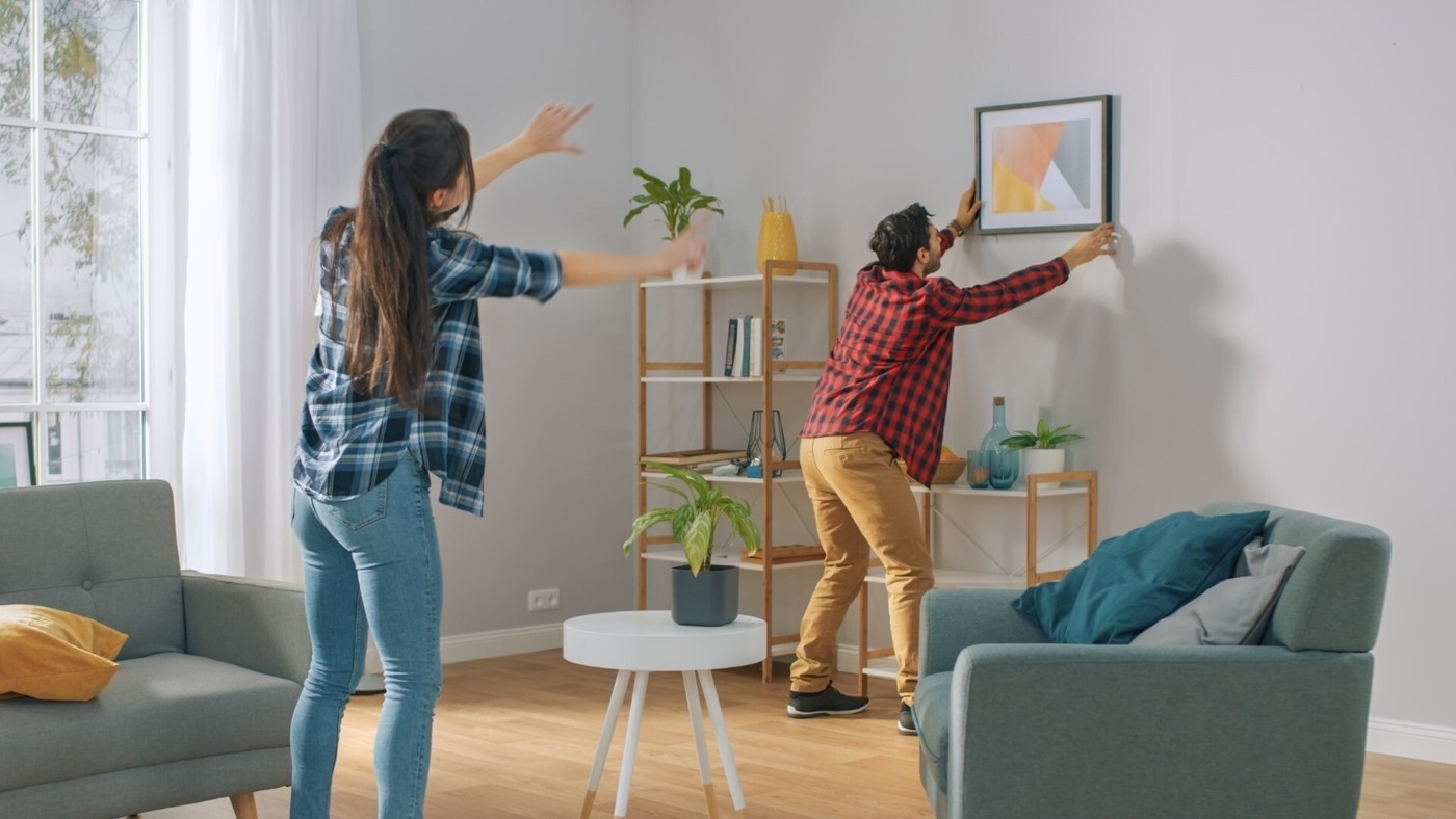
Not having a focal point
A room's focal point is usually located across from the entrance, so it's the first thing you see when you walk into the room. To test if your room has a focal point, simply pay attention to the first place your eyes are drawn to when you walk into the room. If your eyes aren't drawn any particular way, your room might not have a focal point. Rooms that lack a focal point often feel unfinished and dull.
Fixes:
- In some cases, rooms will have a natural focal point, such as a fireplace, a picture window, or an architectural feature. In other cases, you will have to create a focal point. Some common examples of focal points include large-scale artworks, vibrantly painted or wallpapered walls, large furniture pieces, and wall-mounted televisions.
- Use lighting to draw attention to your focal point. For example, highlight a piece of statement artwork with ceiling mounted downlights.
- Use negative space to highlight your focal point. For example, utilize a clean white wall as a backdrop for a sculptural couch in a striking color.
TIP: Once you've established your focal point, the rest of the room's decor should be focused around it. For example, if your living room's focal point is a fireplace, your furniture should be arranged surrounding it.
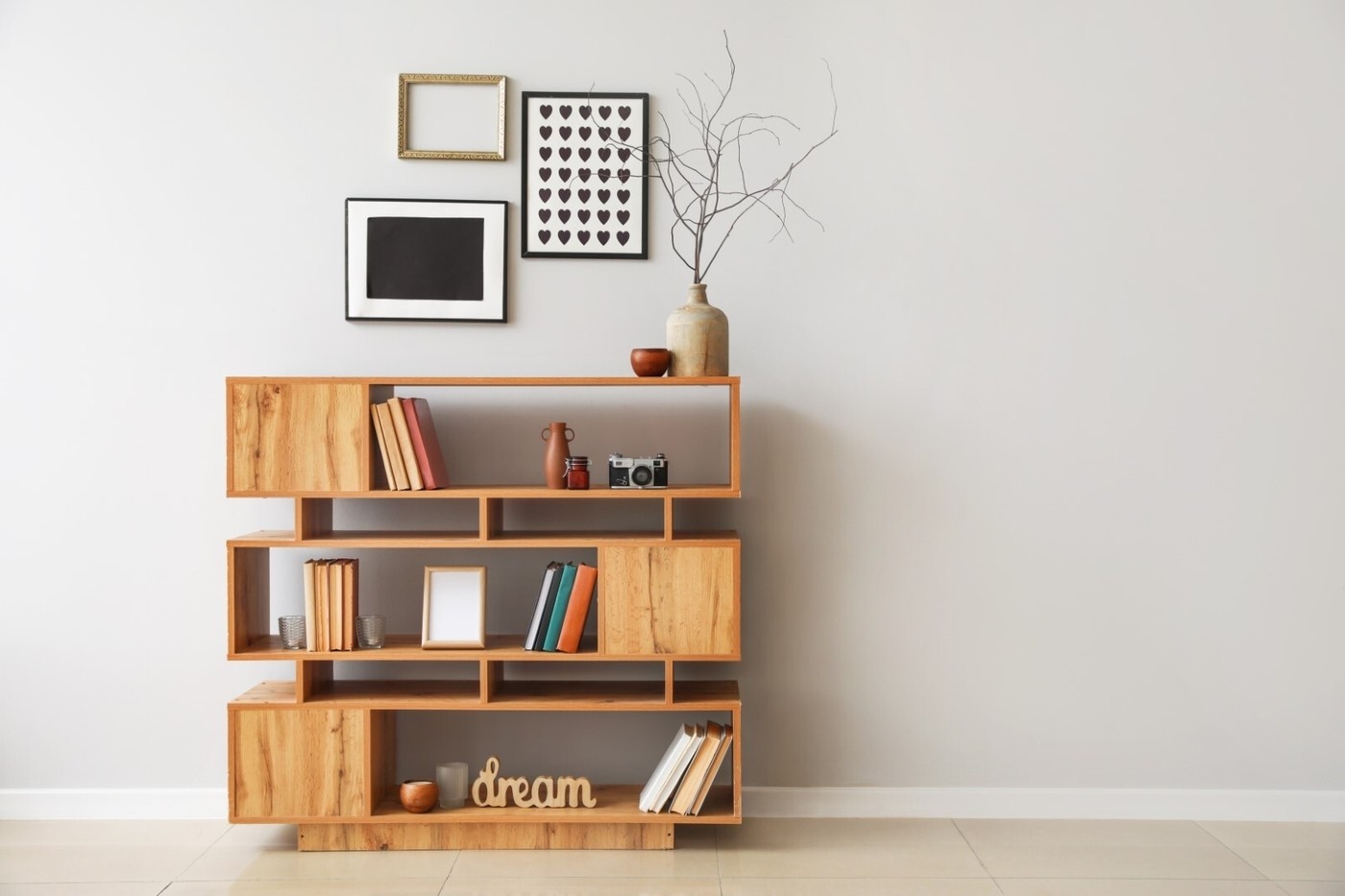
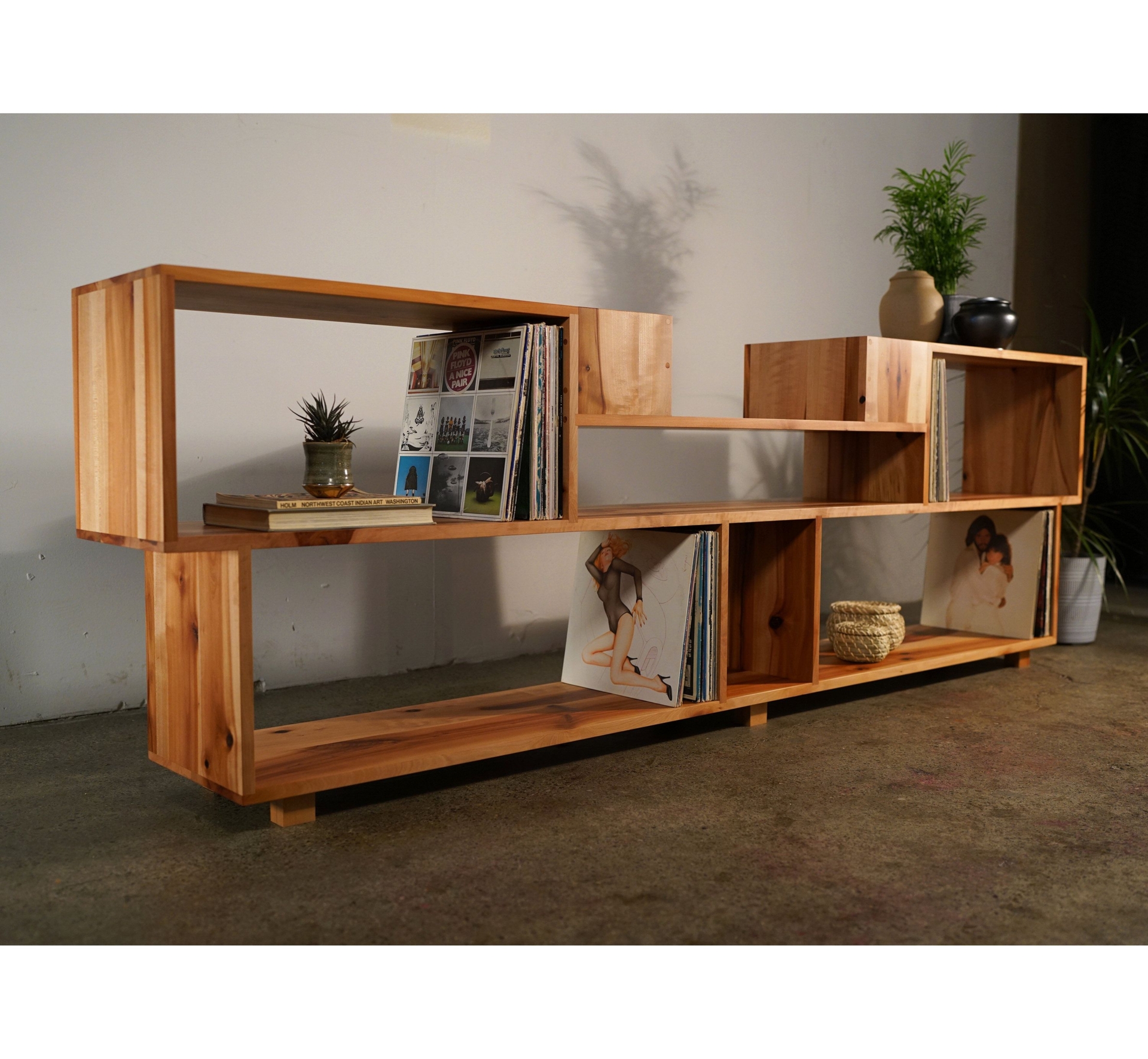
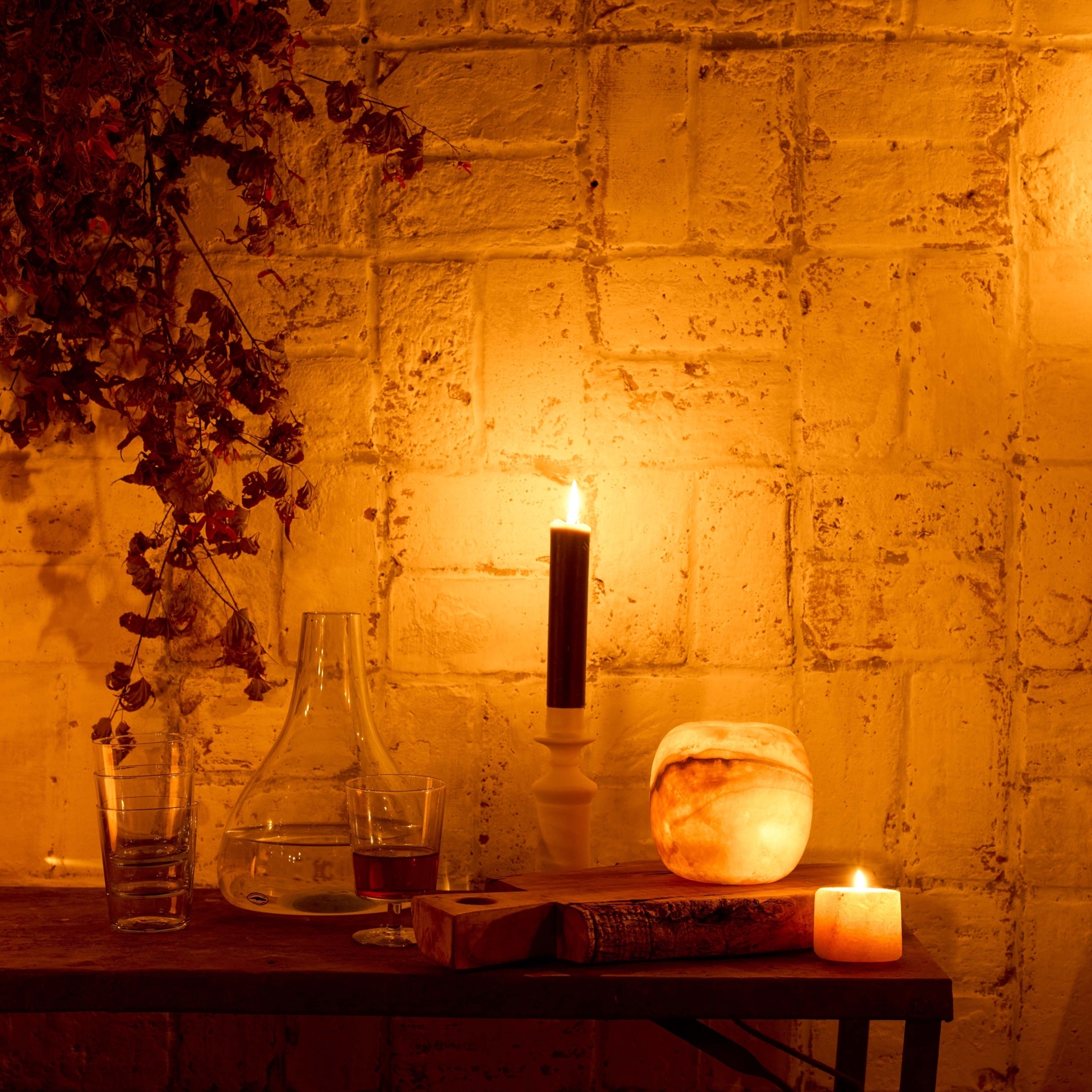
Overcrowded (or underwhelming) vignettes
Vignettes can be displayed on any surface in your home (think shelves, mantles, consoles, and tables) and can be comprised of pretty much anything. But vignettes can quickly become cluttered, which can detract from the rest of your space. And at the same time, an under-styled vignette will look incomplete, which can also detract from your space.
Fixes:
- Empty your existing displays and pare down the items. Vignettes tend to look better when they are curated tastefully and with a critical eye.
- If you're creating a vignette from scratch, start with one anchor item and then build from there. Use cues from your anchor piece to inspire other pieces, but don't be afraid to contrast shapes, heights, and textures.
- Avoid displaying too many small items in your vignettes. Instead, aim for a few larger items and create odd-numbered groupings. Utilize negative space between groupings.
Shop The Look
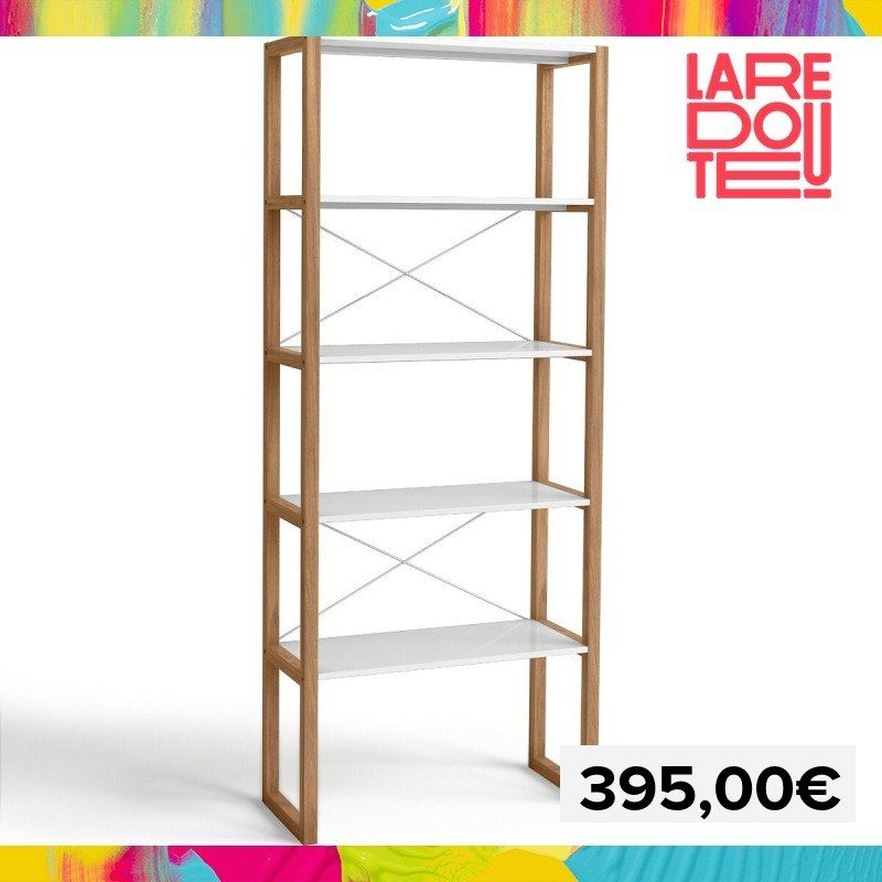
Shelving unit
Shelving unit
Shelving unit
Shelving unit

Shelving unit
Shelving unit
Shelving unit
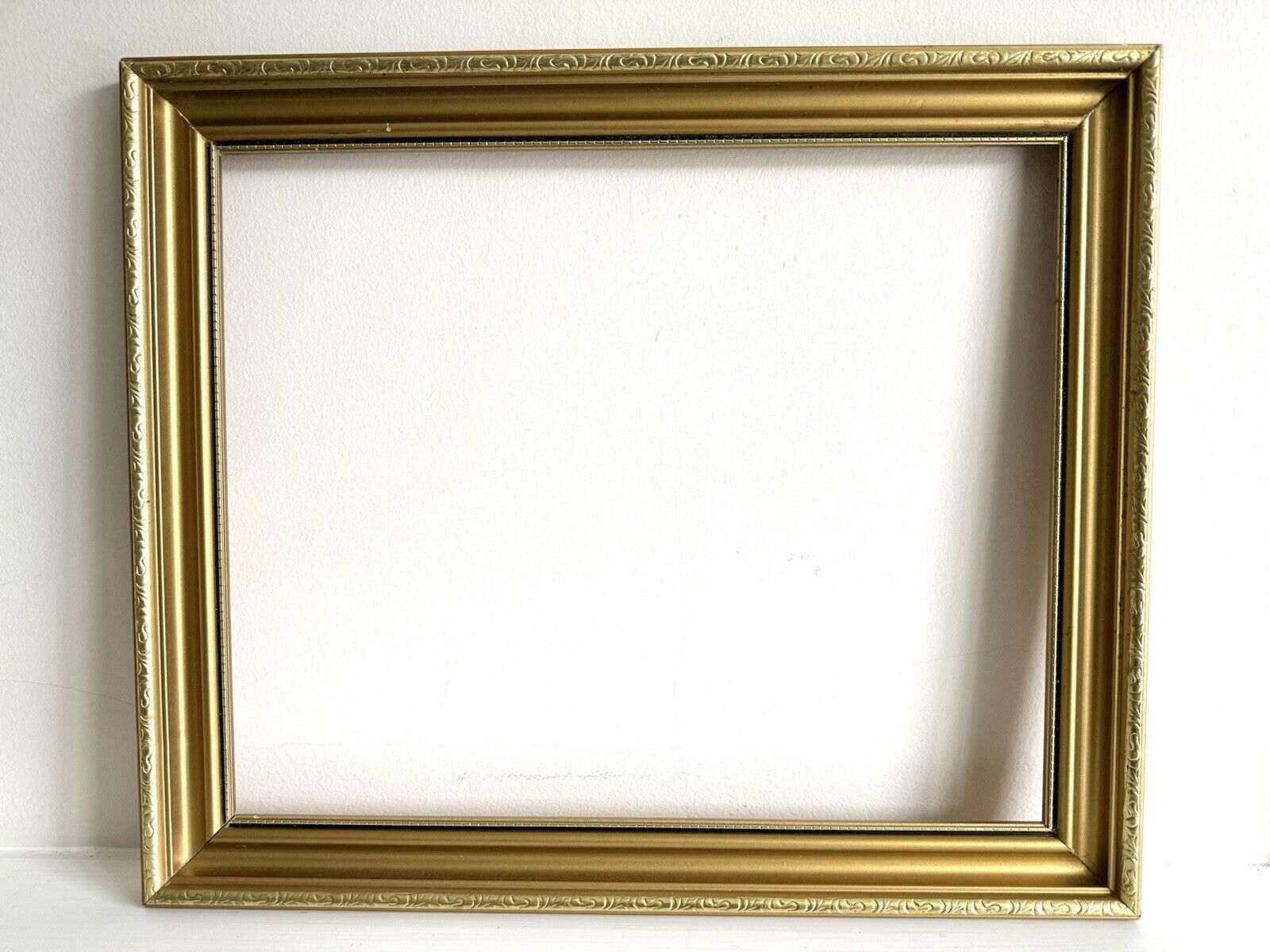
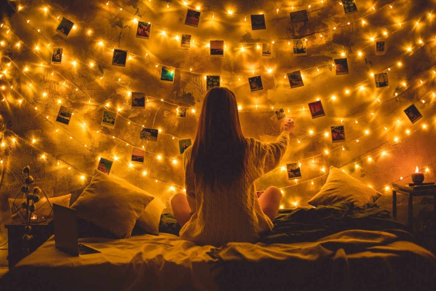
Not enough personal touches
The most meticulously designed space can still feel as if it has something missing if it's too generic. Personal touches are what brings interiors to life and makes them memorable and exceptional. As such, the things you display in your home should reflect what's uniquely important to the people living in the home.
Fixes:
- Displaying personal photos is the most straightforward way to give a space a sense of ownership. Photos can be displayed within vignettes or, if you're looking for a creative way to create a focal point in a room, in the form of a gallery wall.
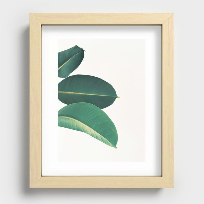
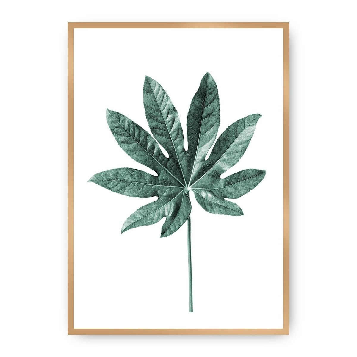
- Express your unique tastes through artwork. You can shop around for one-of-a-kind pieces through online retailers or in person at local art shows and second-hand retailers.
- If you like to travel, you can use your favorite destinations to inspire your home's decor. Open shelving can be used to display sentimental items.
Shop The Look
Pictures on the bed
Pictures on the bed
Pictures on the bed

Zakiya Kassam
Zakiya is a Toronto-based writer covering interior design and real estate. Much of her work involves interviewing interior designers, home stagers, and real estate professionals for various publications. She also writes a quarterly series for a Canadian design publication.


