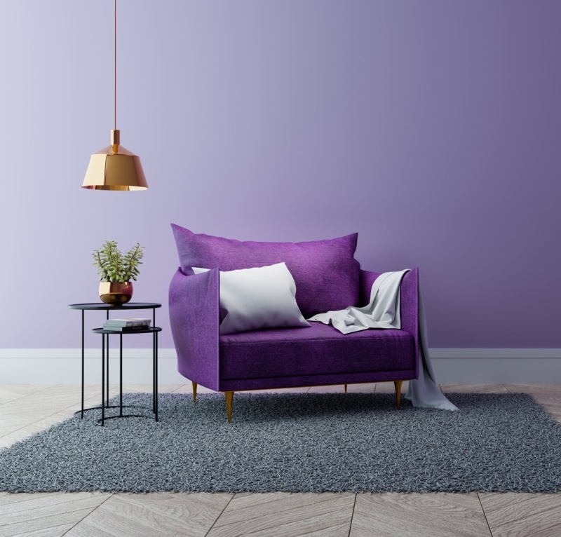
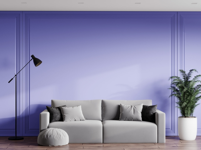
Very Peri Bedroom Ideas
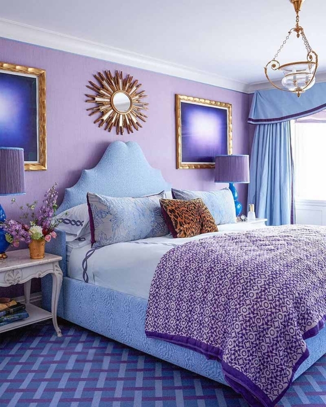
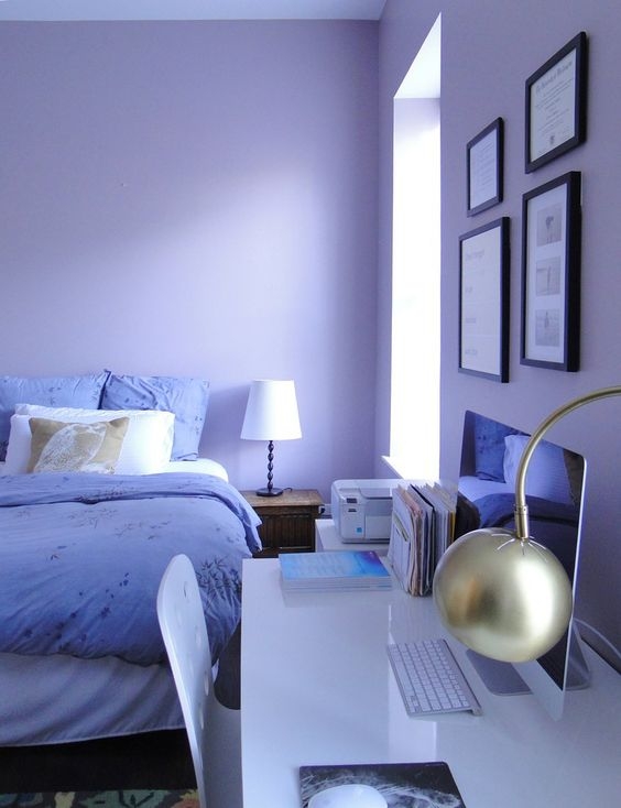
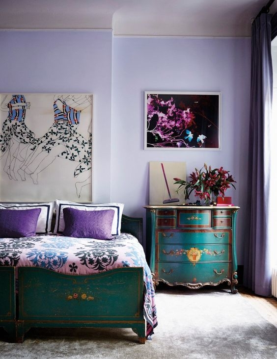
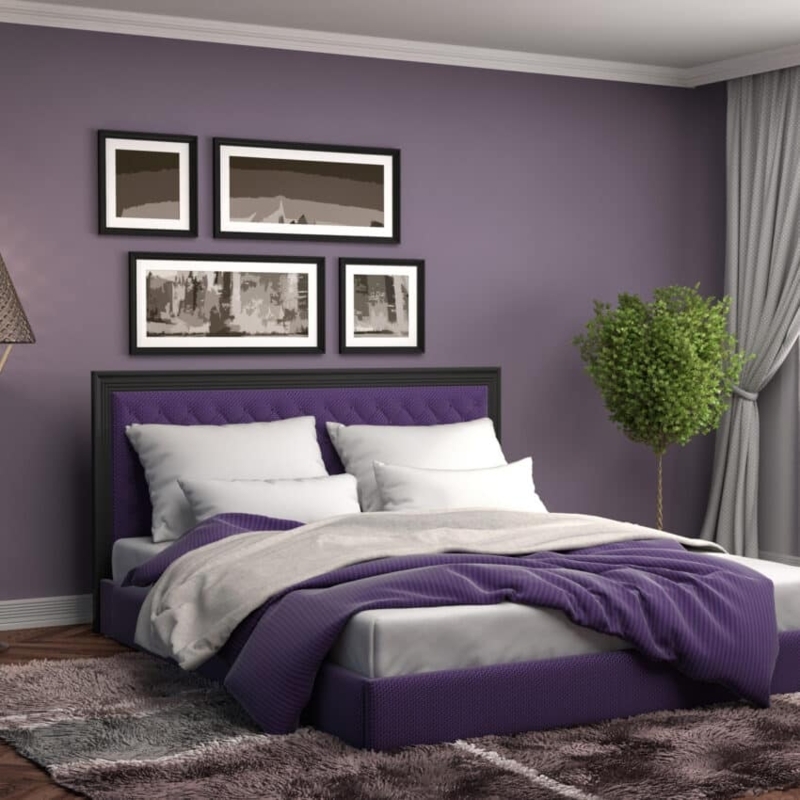
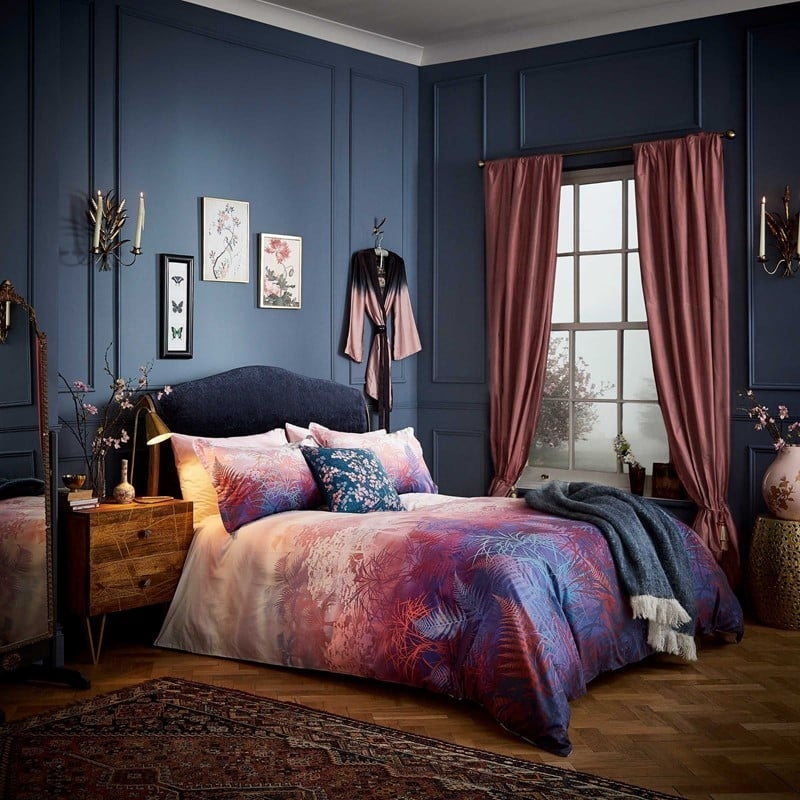
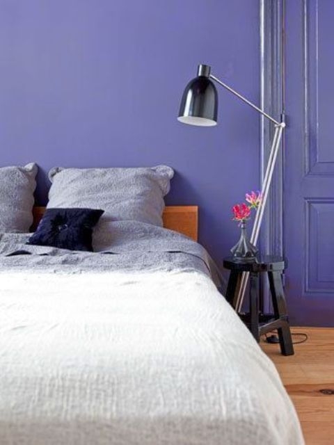
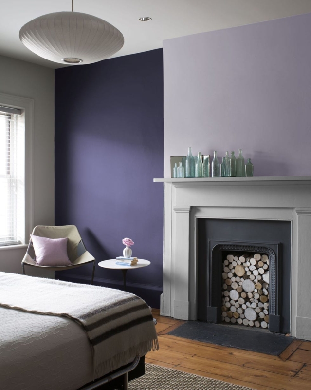
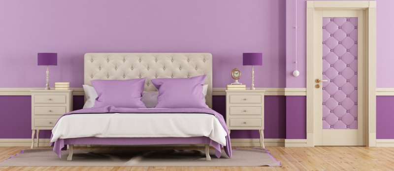
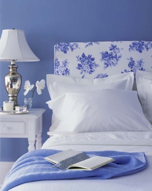
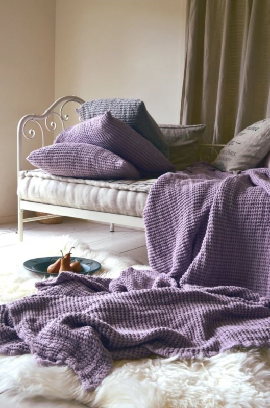
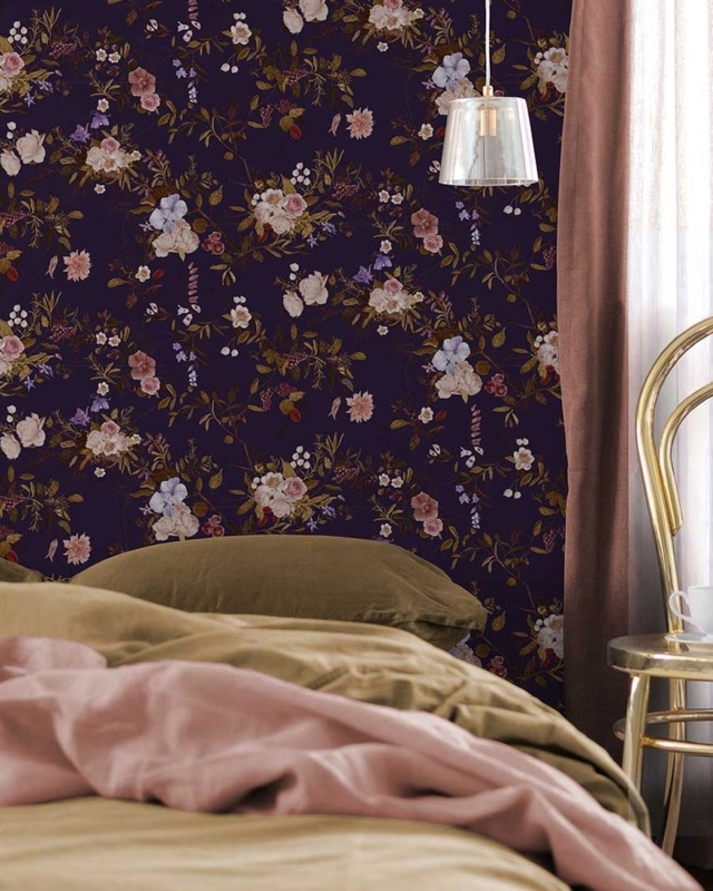
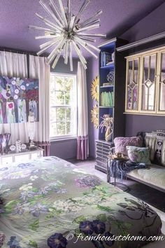
I chose these pieces to help you integrate vibrant Very Peri into a restful bedroom. I prioritized plush velvet textiles and matte metallic accents to ground the bold periwinkle, ensuring a sophisticated, balanced result.
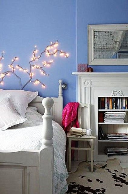
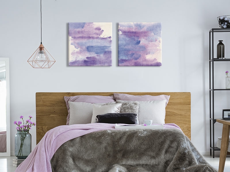
I chose these pieces to help you integrate vibrant Very Peri into a restful bedroom. I prioritized plush velvet textiles and matte metallic accents to ground the bold periwinkle, ensuring a sophisticated, balanced result.